
gum experiments pt. 1: iridescent + duochrome pigments
It’s a weird time to be an artist, but it’s also exactly what I need. It’s what a lot of people need— keep creating for the sake of creating. You don’t have to make masterpieces or earth-shattering social commentaries (but props to the artists that are doing all of that), you can just make art.
It’s kind of a weird time to be an artist.
I feel guilty for making art because it feels frivolous— I have the privilege of owning a creative space and being able to use it now. I’m not making thought-provoking statement pieces; I’m creating for the sake of creating. It’s been the best thing for my mental wellbeing, but it’s important to mention both sides of the coin.
It’s a weird time to be an artist, but it’s also exactly what I need. It’s what a lot of people need— keep creating for the sake of creating. You don’t have to make masterpieces or earth-shattering social commentaries (but props to the artists that are doing all of that), you can just make art. That’s why I took up painting and cross stitch. Do some artists look down at people who follow Bob Ross tutorials? Absolutely. But why? Art isn’t an exclusive club. I’m not saying that my paintings are works of art— I’m not a painter, it’s just fun. It exercises a different set of creative muscles. So follow along to Bob Ross, make a paint by number, doodle on your grocery list, throw a wiggly piece of pottery. You don’t have to create an exhibition piece, and you don’t have to feel bad for not making one.
I’ve been setting up my dimroom again over the last few days— migrating chemistry, trays, and bins of paper down to the front yard shed (my diy dimroon, complete with one outlet and a PVC pipe & a cat litter jug for plumbing). I haven’t printed since July 2019 because life gets busy and messy (and running a magazine is way more than a part-time job).
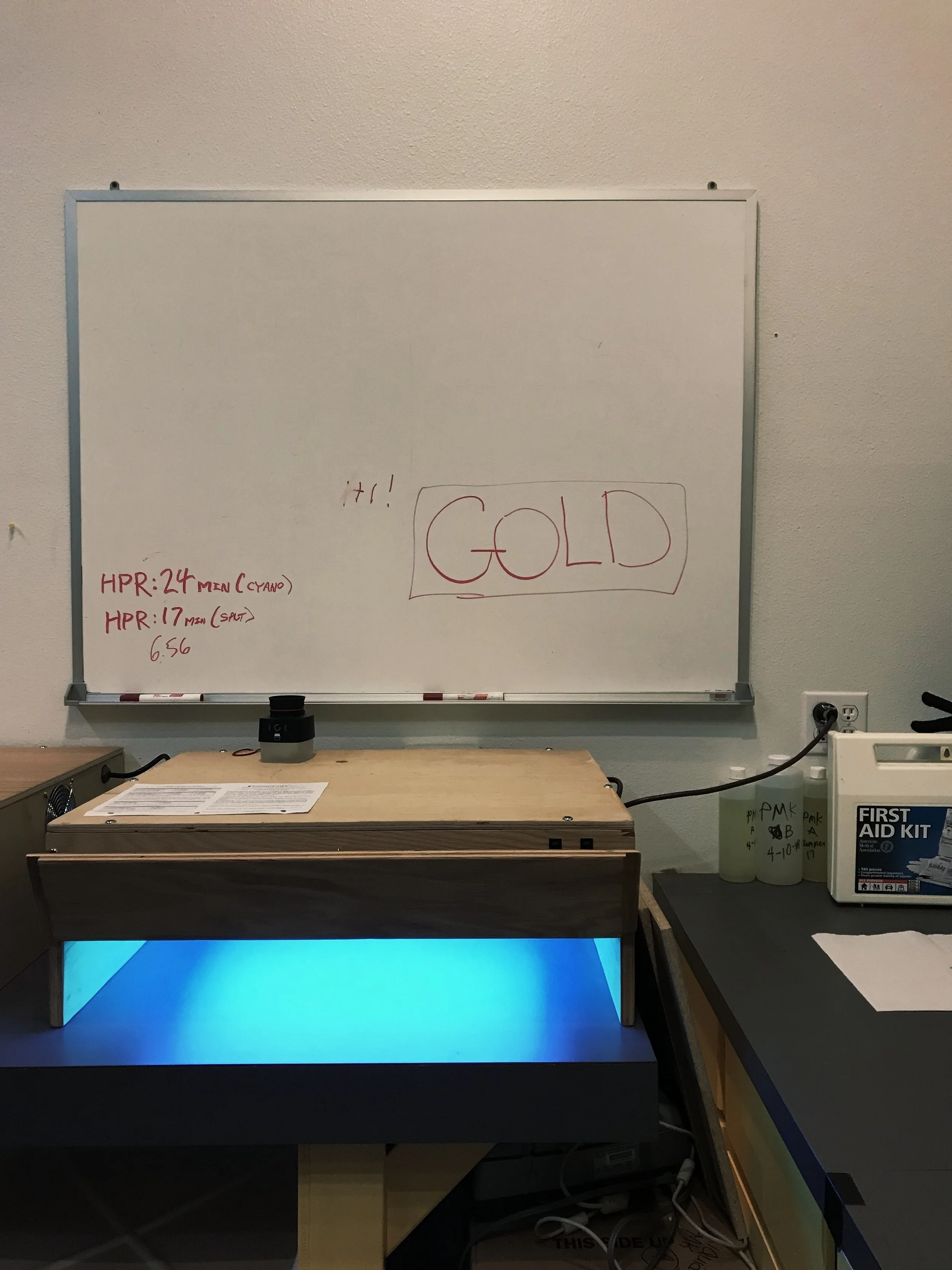
Getting back into the dimroom again is kind of like riding a bike, except everything’s in a slightly different spot. All of the times and measurements are still filed away in my brain, but I have to dig deeper than I do when it’s peak workshop season. I forgot how much citric acid goes into the first cyanotype wash, I couldn’t recall the classic cyanotype exposure time for HPR off the top of my head, it took me a hot minute to remember the steps for a digital negative. I still can’t readily swap celsius to fahrenheit, but it all comes back one way or another.
I first started working with iridescent pigments in 2017— right out of the gate of graduation, after TAing my first workshop. I had the time and the mental capacity to work with different alt experiments, but even then I never finished a print. I got a few layers done before we headed into fall, and then the dimroom was back in my bathroom and I mainly stuck with cyanotypes.
In 2019 I bought two more iridescent/duochrome pigments with the intent of making a print on black paper. After shrinking a massive batch of black paper that was not made to be shrunk and consequentially buying the correct paper, I got three layers of white gum done. Then fall came and the dimroom went back upstairs.

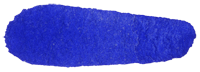
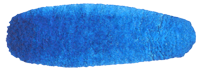
electric blue (iridescent)

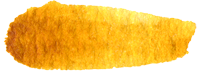
aztec gold (iridescent)

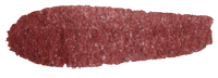
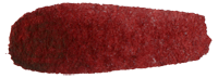
scarab red (duochrome)
desert bronze (duochrome)
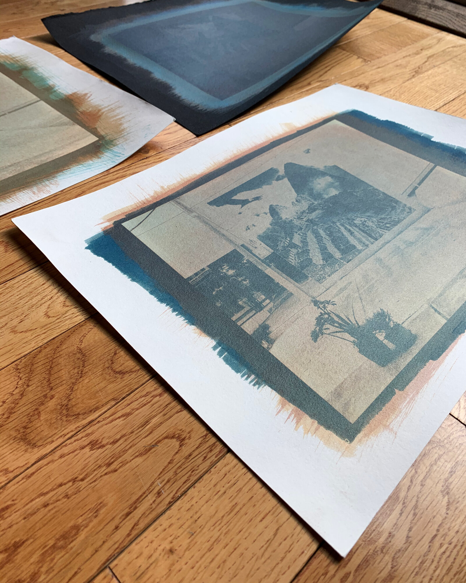
So now, in between magazine issues and in the middle of a pandemic, I’ve finally gone back to those pigments and prints. I do realize that there are better pigments to work with as far as color payoff goes (especially scarab red on black paper, which is essentially nothing in the way of color/pigmentation), but I wanted to try a variety of pigments and see how far it can go.
so, there are four prints:
the control (plain gum on white paper)
iridescent gum on black paper
iridescent gum on white paper
iridescent gum over cyanotype
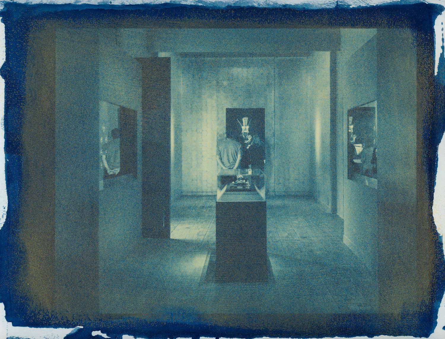
I’ll preface this by saying that I chose one of the worst images I could for this. I love the image and the original gum print, but it is not made for iridescent pigments or black paper. It’s grey concrete and asphalt on a grey day— the highlights are, at best, grey, and the dominant colors are just shades of blue.

the original/control print: standard gum pigments (phthalo blue, nickel azo yellow, q. rose) over a very faint bleached cyanotype.
white gum on black paper
As we know, not all papers are created equal. I found black Fabriano paper pads on sale at a craft store, so I bought three packs (I think they were all under $2 each, so how could I pass that up?). I tore out a few sheets, filled up my bathtub, and left them to soak for an hour or so. However, upon returning to my bathtub, the water was purple-grey (dye), the sheets had separated into individual layers, and everything was stuck together. I tried to take them out of the water, but several tore (because it’s not a water-friendly paper), and as they drip-dried in my shower they left purple puddles. A smarter person would have looked the paper up before buying it and noted that it “accepts light water,” which would not be an hour-long soak.
The paper I’ve used for the print below is Arches Cover Paper in black (250gsm, water-friendly). It does have a smoother side, which I of course didn’t use. Sometimes you’re just too excited to try a new print that you don’t bother to feel the paper, you know?
It was passible as a white gum on black paper (not the best print I’ve made, but definitely not the worst— I’ll add my first go at white gum from 2017 for comparison). One thing I forgot to consider was registration— I always register by eye, but you’ll want to use some form of pin registration for working with white gum.
I used a 12% titanium white for the Perú print, but since I did those layers last year, I can’t remember the time (however, I know it was longer than the standard 2-3 minute exposures I use).

three layers of white gum (12%) on Arches Cover Paper— the registration is off, but the opacity is there

the first attempt at white gum, one layer on Strathmore paper (also not water friendly)
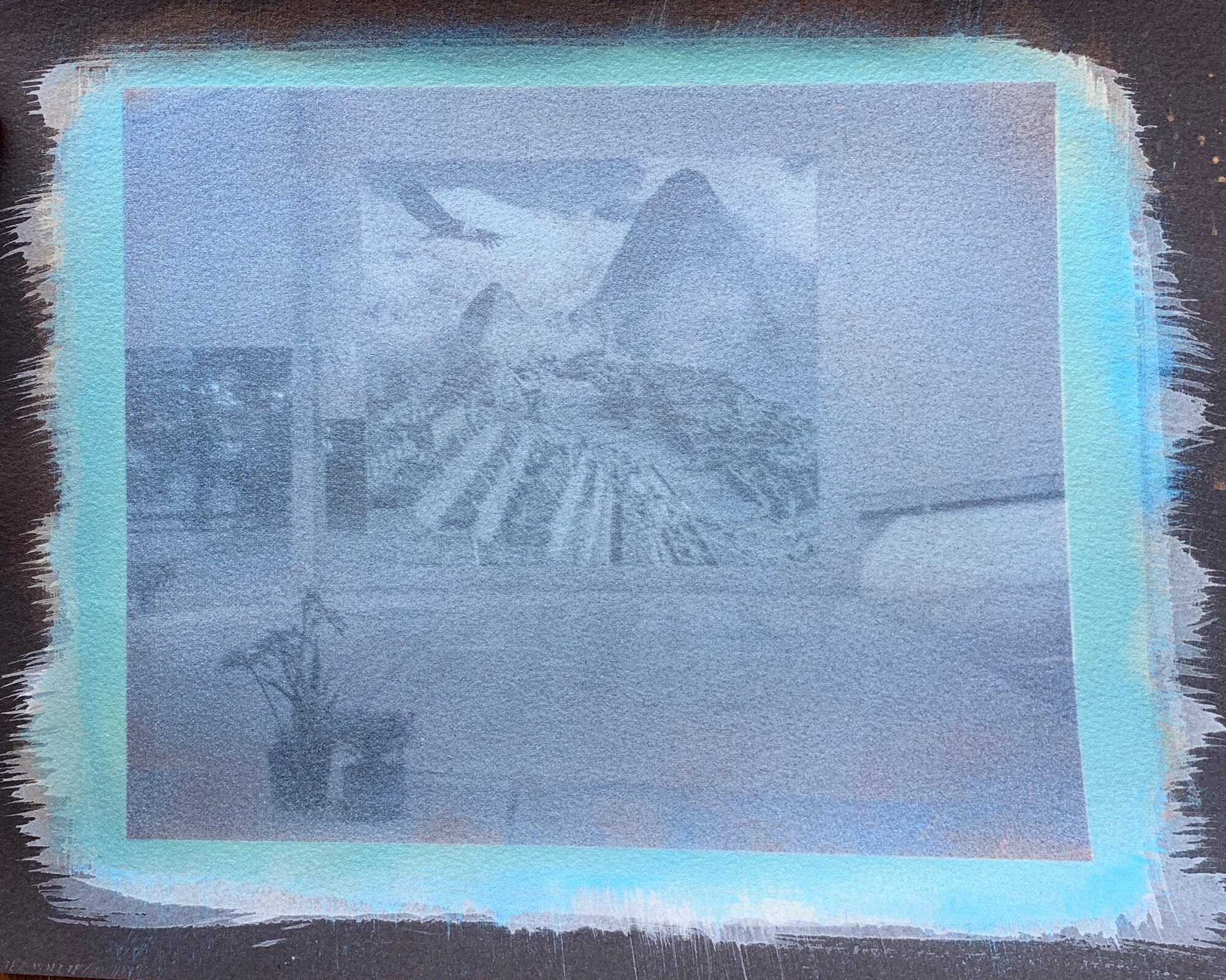
adding iridescent gum
I’ll start by saying this: I made the original print worse. My original thought was to use positives for the entire print, but you only use a positive for the white layers. For the white layers, you’re trying to build up midtones and highlights, which is why you use a positive. However, your color layers go into the midtones and shadows, which is why you use negatives. It seems simple, but I didn’t catch it until after I did a cyan layer with a positive, essentially taking all of those highlights and muddying them up.
Believe it or not, this is technically a tricolor gum. Three layers of white, an accidental positive of electric blue, a correct negative of electric blue, aztec gold, and scarab red. I didn’t expect much from scarab red since it “disappears” on dark paper, but I didn’t anticipate the electric blue to take over (for reference, all iridescent pigments are around a 12% mix— I’ll get exact numbers the next time I’m out in the darkroom).
Since the pigments are iridescent, the final image changes based on the light source. It’s one of those where you can hold it and move it around and see something different, which has some merit as far as “championing the object” goes. However, there is absolutely room for improvement. This is just a starting point, though— you learn from the mistakes you make.

indirect sunlight

window light
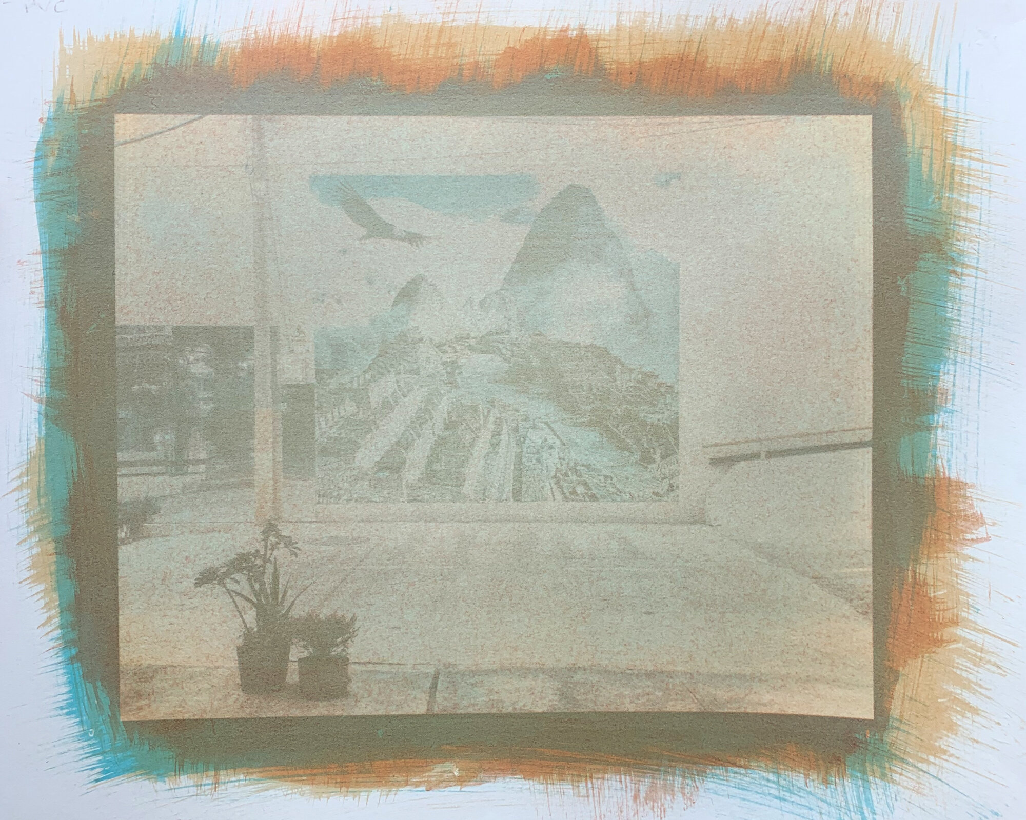
plain iridescent gum
The second variable is a standard tricolor gum on white paper, but with iridescent pigments. I wanted to see how the colors would interact with white paper, since scarab red and aztec gold don’t do a lot on black paper. I again used my standard exposure times (2 minutes for magenta, 3 minutes for yellow, and 2 minutes & 30 seconds for cyan). The result reminds me of natural earth pigments, which I used in the past with a decent amount of effort. If anything, it can be a good way to fake eath pigments without having to grind gum & powder in a mortar. There is still some iridescence, but you completely miss out on depth.
Steps for this print are as follows: standard shrink bath (warm water, about an hour); PVA size; electric blue, expose for 2 minutes & 30 seconds, wash for an hour; aztec gold, expose for 3 minutes, wash for an hour; scarab red, expose for 2 minutes, wash for an hour. I’ll try this process again with a more punchy image, and hopefully the beloved magenta layer won’t stain the paper.

indirect sunlight

window light
iridescent gum over cyanotype
This is the golden ticket: it gives you the best of both. You can register the negatives, but you’re not fighting for shadows. There’s still work to be done and things to iron out, but this was by far the most successful print.
I did a standard classic cyanotype (10/10 ferric ammonium citrate and potassium ferricyanide), but I of course left it in the light box too long. The highlights were completely gone, so I decided to bleach it in sodium carb. The print’s still too dark and the highlights aren’t so great, but it brought it back enough to be able to add some gum layers.
Following the cyanotype, I did a layer of aztec gold and then a layer of scarab red (so just 3 layers total). I could have gone back in with more layers to work back and forth, but since the other two prints are essentially just three layers of color, I wanted to keep this one the same. This print also shows iridescence the best without losing the image quality (probably in part to swapping the dominant electric blue for a cyanotype). It gives off a sort of copper/gold split tone effect with the blues of the cyanotype, which is worth exploring!

the cyanotype layer after going through a sodium carb bleach bath

the tricolor print— cyanotype, aztec gold, & scarab red
in conclusion:
Make what you want to make, break the rules (within reason— keep the chem safety). If it doesn’t work, it doesn’t work. If anything, you’ll learn from your mistakes.


this is part 1 of a multi-part series on experimental gum printing; posts will be added as prints are made.
all that glitters (could be a cyanotype over gold gesso)
A lot of things drew me in to the alt process world— the art of the handmade, the applicable science, and the joy of analog, to name a few. One of the bigger draws, though, was the sense of discovery. I loved that despite alt's established history, so much of it was left to be found. This theory is also why I briefly wanted to be a marine biologist as a teenager, until I realized that it's not just scuba diving and exploring the uncharted waters of the world. But, even though the math and science would fly over my head, the discovery made it entirely enticing. Alternative processes are my photo world marine biology.
The best part of it all is that you don't have to find anything ground breaking. You don't have to reinvent the camera, you can just try something new. This is why I love experimenting with new pigments and papers, even if I'm almost certain that they won't be successful. You never know.
In that same vein, I recently tried printing cyanotypes over gold gesso at my Salt & Cyanotype workshop (which, by the way, major shoutout to the most top-notch student/person out there, Sarah B. Gilliam). Like I said, it doesn't have to be anything ground breaking— I've already printed salt over gesso. Cyanotype over gesso wasn't wildly exotic, but I hadn't tried it (nor had I seen anyone else work in cyanotype over gesso— if you have, let me know! I'd love to see their work). So, in the spirit of "why the hell not," I tried a cyanotype over gesso and it worked.
It wasn't so much that I didn't expect it to work, but I do have a track record of failed experiments (i.e. printing salt on cellulose-based Bhutan paper, printing salt with sulfuric fertilizer, printing gum bichromate on wood, you get the idea). The important thing, though, is that this one worked.
Endless enthusiasm courtesy of Sarah.
Once we got a system figured out, we were off and running. Almost every print had gesso on it— gesso under, gesso over, applied gesso— everything was covered in gold. It was serendipitous to be at a workshop, as it was perfectly acceptable to give every print the Midas touch from nine in the morning to midnight.

Cyanotype over gesso. ©Sarah B. Gilliam 2018

The first cyanotype over gesso of the week. ©Megan Crawford 2018

Cyanotype over gesso. ©Sarah B. Gilliam 2018
It all took me back to dreaming of discovering something new, be it a new species of coral or an underwater cavern that had its own thriving biosphere (I was rather imaginative when it came to the ocean). In this case, it was a subspecies of a process.
In short, this was pretty cool. What made it even better was sharing that experience with a student and being equally giddy about something as theoretically simple as gesso under a cyanotype.

CYANOTYPE OVER GESSO
Materials used:
Coating apparatus (Connoisseur hake brush, calligraphy brush, Puddle Pusher, etc)
Potassium Ferricyanide (PF for short)
Ferric Ammonium Citrate (FAC for short)
Hydrogen Peroxide
gesso prep & coating
Start out by diluting the gesso (I typically dilute down to 25%). Full strength gesso is great for brushing detailed bits on after the print is done, but even 50% is on the strong side for under cyanotype. Always mix the diluted gesso in its own designated cup. You don't really want to dilute down a $25 pot of gesso, especially if you're planning on using different solutions. I used distilled water to dilute the gesso, but it's not necessary.
Once the gesso mixture is ready to go, pour 1 teaspoon onto the center of the paper. Disperse the gesso over the paper with a foam roller, apply even pressure. To smooth out the gesso, lightly roll over it (and I mean lightly— just set the roller on the paper). Once you're satisfied with the gesso, you can blow dry it.
cyanotype prep, coating, exposing, & processing (classic)
I now use 10% solutions for both FAC and PF thanks to Christina Z. Anderson's extensive research. The 8/10 solutions still work, but the 10/10 is smoother and faster (thank you, Chris!). Mix your individual solutions, then combine them 1:1 as you would any other Cyanotype. I use a Connoisseur hake brush, a calligraphy brush, or a Puddle Pusher to coat the paper. Evenly disperse the cyanotype solution, let it air dry for 10-20 minutes, (depending on humidity) and blow dry. Use your standard cyanotype exposure time.
When the exposure is complete, process the print as normal. You'll need two trays: one for a citric acid wash (½ tsp of citric acid in water), and one for a regular water wash. Agitate the print in the citric acid wash for 2 minutes, transfer to the water wash, and agitate for 10-20 minutes. You can add the optional hydrogen peroxide at either step.
If anything, you can always bleach and tone a cyanotype (and, if you don't like how it toned, a citric acid wash will revert it back). Cyanotype is a forgiving process. You could also have a go at hand coloring, embroidery, or my personal favorite, gesso.
Thank you to Sarah for being a such a wonderful and sweet student, and to Chris for being a wealth of help and knowledge! None of this would have come to be without you two.

testing bhutan paper with salt printing
You might recognize the err of my ways just by reading the title, but my personal philosophy with printmaking is if you can think it, you can try it.
This Bhutan postcard paper from Hiromi Paper is beautiful. It's weighty, it's textured, and it's handmade, which means it has deckled edges. I'm a sucker for a deckled edge, and they're only $1.50 a postcard. They basically asked me to buy them.
Now, since I am the way I am, I wanted dive in head first with salt printing. When I say this paper is weighty, I mean it. It's a similar thickness to the Swedish dishcloths I use, but that didn't deter me from tossing a few sheets into some casein size.
Of course, since the paper is cellulose-based (like Swedish dishcloths) and dense (like Swedish dishcloths) it absorbed an ungodly amount of casein (like a Swedish dishcloth would). The postcards turned into little sponges. They took over a day to dry. I still wanted to keep trying, though.

After exposing, before processing.

After exposing, before processing.
Bhutan paper prints similarly to hu'un. Its wonderful, natural texture equates to an uneven absorption of chemistry. The two images above are after exposing but before processing. As you can see, there's a lot of unexposed silver nitrate. Think of it as painting— you have to let your first layer of paint dry before you add a second layer. The thickness of this paper led to upper layers exposing, while deeper layers went unexposed.

After processing, before drying.

After drying and hanging for a few days.
This paper would most likely require longer bath times to compensate for the thickness, but I wanted to stick with my standard processing to see what it would do. Surprise surprise, the silver nitrate didn't completely rinse out of the paper. This resulted in the images disappearing after a few days (one of those which was spent drying).
In short, it's a beautiful paper. It would be perfect in a hand-bound book. It absolutely does not work with salt, but I'll still try it with cyanotype— not because I want to make a perfect print on it, but because I'm wildly curious and genetically stubborn.


running supply list
Note that these are the items I use— you can buy whatever you want! I'll update the list as new items come to mind or are purchased.
(also, I’m not getting any compensation from this, I just like making lists and sharing what I know. However, if any photo brands are interested, y’all know where to find me)
FIRST AND FOREMOST
The holy grail of my dimroom, the thing that is next to coffee on a list of important things, the item I would take with me to a deserted island so I could properly organize rocks and coconuts as I slip into insanity:

If you are a member of the label maker family, hello. You know how this goes. If you've never set a hand on a label maker, let me welcome you to a land of clearly marked bins. Once you label one thing, you label everything. Your world is organized, cherubs toting harpsichords fly down from the heavens, your student loans are magically paid off.*
*Note that while a label maker is a physical apparition of the unicorn, it will not do all of those things.
LABWARE
Pyrex beakers (set of 5). This particular set contains a 50ml, a 100ml, a 250 ml, a 600 ml, and a 1,000 ml. There are cheaper sets available, but when it comes to glassware I'd rather go with what's more sturdy.
Yankee trays: 11x14 and 8x10 (set of 3). These are some of the cheapest trays I've found (you only pay $6 a tray for the 11x14 set!). The bottoms are very slightly ribbed, but they don't dip down (so you don't lose precious chemistry, which is especially important in regards to gold toner, etc). I absolutely love Cescolite trays, but they're a bit out of my budget ($20 for an 11x14 tray, $14 for an 8x10 tray).
Swedish dishcloths. Hear me out on this one. Swedish dishcloths are biodegradable, incredibly absorbent (around 15x their weight), and they're happy! I've had people mistake my dishcloths for prints. They're perfect for drying brushes, cleaning beakers and trays, cleaning up spills, etc. They replace sponges and paper towels. I currently have an 11x14 drying mat and two standard 7⅞" x 6⅝" cloths (specifically this yellow daisy one and this tribute to Hokusai). You can also find this set of Skoy cloths on Amazon for $7 for a set of 4 (seriously, it's a steal).
OXO angled measuring cup. For when the measurements on beakers aren't specific enough.
Measure-n-Pour glass. This beauty measures millimeters, liquid ounces, teaspoons, and tablespoons, all for $2!
Milk jugs. If you're also working in a lab that doesn't have running water, save those gallon containers. They're perfect for storing water, diluted fix, etc.
Cat litter jugs. Once again, no running water = no drainage system. Cat litter jugs make a perfect dump tank, especially for materials that have to be taken to hazard waste.
Tongs. I'm currently using these tongs, but these were the ones I used at MSU (go for the second link, you get a set of three for a buck or two more. Learn from my retail mistakes).
A thermometer. This is what I'm currently using, but because I am an American™ I'm not the best at translating celsius. Choose your degrees accordingly.
Plexiglass. This is what I bought, you can also find sheets of plexiglass at hardware stores.
Measuring spoons. My mom generously gave me the plastic OXO set that we've had since the mid 2000s because she knows how much I love them. Make sure your measuring spoons are not metal.
A kitchen scale. It doesn't need to be a fancy, science grade scale. I use a Taylor scale and it does the job just fine.
THE "Big" ITEMS
A contact printing frame. Photographer's Formulary and Bostick & Sullivan both sell print frames. You could also make your own.
A UV light box. I was recently gifted a Photographer's Formulary UV light box (which is !!!). The valley I live in is notorious for its gloomy winters, which renders printing without a light box tricky. For the summer of 2017 I solely did sun exposures. You can do it, but do keep your region's seasonal weather in mind. With a UV light box you'll have consistent times. Times for sun exposures will vary from season to season. You can find light boxes at Photographer's Formulary, Freestyle, eBay (potentially), or you can build your own.
A scanner. You need to save your work somehow, right? I'm currently using an Epson V600 and it's been great. I've also used an Epson V750 (the newer model is the Epson V850) and an Epson Expression 11000XL. My scanner cost me all of $100, while the V850 runs for $1,000 and the 11000XL runs for $3,425 (note that the two latter scanners are not mine, but the scanners at MSU). The V600 has the ability to scan film, as does the V850 and the 11000XL. The main difference is that the V600 has a strip transparency scanner for film (you can scan two 35mm strips, four slides, or one strip of 120mm film, no 4"x5" film). Both the V850 and the 11000XL have full transparency scanners.
A printer. If you're working with digital negatives, you'll need some kind of pinter. Paper negatives are always an option, and you don't necessarily need a high-end printer for that. I've used an Epson 3880, an R2400, a 2200, a P800, and a P700. I haven't bought a printer yet, but I'll be buying the P800 eventually. For now, the older HP printer I have access to is printing off workable paper negatives.
2017 update: I bought a refurbished P800. It lovingly lives on what used to be my coffee table.
2020 update: Do note that, at some point, you will have to replace your ink & maintainence cartridges. Ink cartridges technically have an expiration date, but I stretched mine out an extra two years. You can buy ink sets in bulk or individually, but it is not cheaper to buy a complete ink set. You think it would be, but alas— I buy my ink cartridges when they’re running low to ease the cost.
A light box. If you're doing any prints with multiple layers, you'll need a light box to register your negative. I'm currently using a Bretford Acculight 6000 that I received for free. You can find used light boxes for pretty cheap (Bretford, Porta-Trace), or you could build your own.
2018 update: I came across this light board, and it works perfectly for alt. It has adjustable brightness, it’s compact, and it’s only $23!

BRUSHES
*Note that Connoisseur brushes can be found at cheaper price points than what is listed on the Connoisseur website.
Connoisseur hake brushes. I use hake brushes for gum printing, salted paper, and cyanotype. Note that your salt brush should only be your salt brush to avoid cross-contamination.
Connoisseur white taklon brushes. I use a 1" square brush and a 2” square brush (the MSU bookstore has a significantly better deal on brushes) for cyanotype and a ¼" brush and a ⅛" scrubby brush for gum brushwork.
Calligraphy brushes. Calligraphy brushes are perfect for experimental darkroom work.
Foam Brushes. You can use foam brushes for coating PVA, sensitizing for salt, and sensitizing for cyanotype. You’ll know that they aren’t contaminated, but you can’t reuse them. I personally don’t use foam brushes because I’d rather have a better set of brushes I can reuse.
Kobayashi. (shoutout to Christina Anderson for introducing me to these amazing brushes!) If you’re really looking for a staple brush for your darkroom, go with these. They have stitched ferrules like the Connoisseur hake brushes, and they have synthetic hairs like the taklon brushes (really, you get the best of both). They are an investment, but they don’t soak up as much chemistry and they’ll last. The money I’ve spent on cheap brushes could have bought me a couple of Kobayashi brushes by now— hindsight is 20/20, but I am farsighted.
ChemIstry/pigments/paper
Bulk chemistry. I almost always buy my bulk chemistry from Photographer's Formulary. Artcraft Chemicals, Freestyle and Bostick & Sullivan also sell bulk chem. If you want chemistry lists for specific processes, head to my About the Processes page.
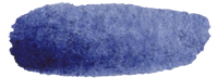


Pigments for gum printing. I primarily use M. Graham pigments— they have an extensive color variety and I've never had an issue with them. The order of the swatches above correlate to the list below (swatches are courtesy of the M. Graham website). The M. Graham pigments I'm currently using are:
Anthraquinone Blue. Anthra Blue is a "blue jean" blue.
Ultramarine Blue. Ultramarine is a true, classic blue. It's a very royal blue sort of shade.
Phthalo Blue. Phthalo Blue is more of a sky blue. It's the lightest blue M. Graham pigment I use.
Prussian Blue. Prussian Blue is a soft, yellow-toned shade of blue (think cyanotype blue).
Hansa Yellow. Hansa is to yellow as Ultramarine is to blue. (*I'm not currently using Hansa, but I've used it in the past and I love it).
Nickel Azo Yellow. Not to be confused with Azo Yellow, Nickel Azo Yellow is a gold shade. Azo Yellow is a baby duck, whereas Nickel Azo is a rubber duck.
Terra Rosa. Terra Rosa is a historic pigment. It's not as deep as P. Maroon, but it's more bricky.
Perylene Maroon. Perylene Maroon is blood red. It's a deep, fairly neutral red.
Quinacridone Rose. Q. Rose is your standard magenta. Not too red, not too blue.
Azo Orange. Azo Orange is orange. Think of a glass of concentrated Tang, and you have Azo Orange.
Chinese White. Chinese White is slightly off white.
Pigments (cont'd). I've also used Grumbacher pigments. These are definitely not as nice as the M. Graham pigments, but I've yet to notice any major issues. If you’re interested in gum but don’t want to have a huge monetary commitment, cheap pigments are a great way to get started. The same goes if you’re interested in seeing the validity/usability of a pigment before you splurge on a nicer brand. The Grumbacher pigments I've used are:
Indian Red. Indian Red is more brick and earthy than Perylene Maroon.
Indian Yellow. Indian Yellow is closer to Hansa Yellow.
Sap Green. Sap Green is an earthy yellow-green. It's not in my regular set of pigments, but it's a nice shade when your print is in need of a bit of green.
Turquoise. The Grumbacher Turquoise is a traditional Caribbean Sea shade of turquoise.
Pigments (cont'd). For powder pigments I use Natural Pigments. Each pigment has a description of its source and history. The Natural Pigments pigments (ha) I've used are:
Indian Red. The thing to note with natural powder pigments is that they are nowhere near as intense as manufactured tube pigments. Indian Red and Blue Ridge Hematite are two of the more pigmented shades I have. The powdered form of Indian Red is still brick and rather earthy, but it's quite a bit lighter.
Blue Ridge Hematite. Hematite is a cooler red.
Limonite. Limonite is a sort of grey yellow.
Ultramarine Blue Ash. More of the traditional fresco blue.
Lamp Black. This is by far the most pigmented powder I have. It's a cooler black, but it will give you the contrast that powder pigments often lack.
Pigments (cont'd). Daniel Smith also has a variety of watercolor pigments. They're a similar quality to M. Graham, but there seems to be significantly more color availability. The Daniel Smith pigments I'm currently using are:
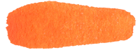
Iridescent Aztec Gold. This is a very true metallic gold shade— it's a metallic iridescent shimmer. (experimenting as of 8/2017)
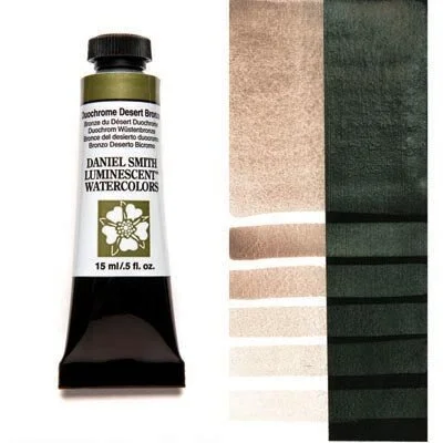
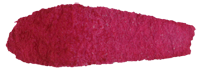
Duochrome Desert Bronze. Desert Bronze shifts between copper and a sort of dark sea foam green (it almost mimics a copper patina). It has the same metallic iridescence that Aztec Gold has, but it shifts colors depending on lighting and paper color. (experimenting as of 8/2017)
Iridescent Scarab Red. This is another duochrome pigment, which honestly probably isn’t good for gum (this, however, is why I’m working with it). Scarab Red shifts between burgundy and blue-green— burgundy primary on white paper, blue-green primary on dark paper. (experimenting as of 2021)
Iridescent Electric Blue. Electric Blue is exactly what it sounds like— pigmented, neon, intense. Think phthalo but multiplied by 100 (experimenting as of 2021)
Paper. You can use whatever watercolor paper you like (or whatever paper can handle water/wet chemistry for that matter). Here are the papers I use:
Hahnemühle Platinum Rag (cyanotype, gum, platinum, salt) 2020 update: I essentially only use Hahnemühle now.
Arches Platine (cyanotype, gum, platinum, salt)
Asuka from Hiromi Paper (Updated7/13/18: Asuka unfortunately does not work with salt in the long run. It's a beautiful paper, but it works best for digital printing, not alt).
Hahnemühle Sumi-e (cyanotype)
Masa (salt)
Weston (cyanotype, but no longer made)
Hu'un (experimenting with as of 7/2017; cyanotype)
Bhutan paper (experimenting with as of 9/2017)
So far I've only tried this paper with salt. One thing to note is that it has about the same absorbency as a dishcloth— it will eat up a lot of chemistry. That being said, the prints I've worked on have been splotchy and uneven (similar to salt on Hu'un, but significantly more splotchy). I'll try cyanotype next, but this is probably one of those papers that simply isn't suited for baths. In terms of paper aesthetics though, it’s a 10/10
2021 update: Bhutan does work with cyanotype. You will get some anomalies in focus from the paper texture, but it hold the chem beautifully.
Transparency film. If you're doing alt-y things, chances are you're printing digital negatives. I only use Pictorico OHP transparency film (Ultra Premium for salt printing and Premium for everything else). You could also use standard office printer paper to make paper negatives.
2019 UPDATE: Fixxons carries transparency film that works just as well as Pictorico, except it’s 100 sheets for $29 instead of 20 sheets for $18 (which is !!! yes). They carry sheets (up to 17’x22’) and rolls (up to 42'“x100’). However, Fixxons will not work with salt negatives— Pictorico Ultra Premium is still the best option for salt.
STORAGE/CONTAINERS
Various bottles (plastic, glass). I have bottles from Photographer's Formulary, Nalgene (specifically this one), and I also use squeeze bottles (similar to these). The squeeze bottles are perfect for gum pigments— you can measure out the amount of mixed pigment down to a drop. I keep my silver nitrate, ammonium dichromate, and cyanotype chem in brown glass bottles. Ammonium dichromate does not need to be kept in a brown bottle, I just prefer to keep it in glass and like the ease of using a dropper for measuring chem.
Plastic drawers. I have this drawer set for storing paper (a drawer for plain paper, a drawer for salt paper, a drawer for gum paper), and I have this drawer set for brushes, labware, and chemistry (it also doubles as a dark drawer for more light sensitive processes).
A spray bottle for gum printing. Be sure to buy one that can spray a fine mist.
Portable workspace. Since I’m limited on space in my darkroom, I have a secondhand typewriter table that fits underneath my sink. If I’m processing salt prints, I’ll set up the final wash tray on there since I can’t fit every tray in my sink. During the winter, when I move my setup indoors, I use a 6’ Costco table as a workstation.
items of importance
Books. If you’re been on my website for more than five minutes, chances are you’ve come across a spot where I recommend Christina Z. Anderson’s books. If not, here’s another:
Tape. I personally use Scotch removable tape or Scotch wall safe tape. The standard "green" Scotch tape will usually take off layers of paper and leave a residue on your digital negatives.
pH test strips. While they're not entirely necessary, pH strips are helpful if you're working with specific levels of alkalinity or acidity.
A blow dryer. If you, like me, don't do anything to your hair, you can take that dryer out from under your sink and put it in your dimroom.
Clothesline. The fancy retractible kind or the string kind work equally well.
Clothespins. There isn't much to say about clothespins, but I do prefer wooden clothespins to plastic ones.
Hangers. Be sure to buy hangers that clothespins would fit on. Wire hangers will always work. I currently have plastic hangers that are thin enough for the clothespins to fit on.
A shower tension rod. If you don't want to use a clothesline/don't have the space for one, you can use a tension rod and hangers to dry prints. I used a spare tension rod when I was sizing paper in my apartment and it worked perfectly. I now have a tension rod in my shower for winter printing, and it saves a ton of space when combined with the hanger/clothespin system.
A mortar & pestle. If you're using powder pigments or other materials that need to be ground in (think toning materials for cyanotype, plant matter for anthotypes), a mortar and pestle would be quite handy. I got mine at tjmaxx for $7, it looks fairly similar to this one from World Market. So far I haven't had any major issues with pigments staining the white marble.
Sandpaper. I sharpen my watercolor pencils with sandpaper. I've also taken gum and PVA layers off with sandpaper as a last-ditch effort to save a print.
General office supplies. Pens, pencils, paper, rulers, scissors— you think this would be obvious, but as I was trying to make this list I realized that I don't have non-art paper in my dimroom.
General cleaning supplies. I use Simple Green for everything (except glass, I use Sprayway cleaner). I’m a fan of Meyer’s cleaning products as well.
An apron. I bought my canvas apron at Michaels in 2016 and it's still mostly in one piece.
Gloves. When I started out in alt I used gloves religiously. They aren't necessary, but I think they're good to wear when you're starting out. I only wear gloves when I mix silver nitrate or ammonium dichromate (but also, always wear gloves when you mix toxic chemistry).
Towels. Designate old/ratty towels for your darkroom, especially if you don’t have running water and are using an old cat litter container as a catch tank and sometimes forget to check if it’s full and, therefore, flood your darkroom.
Watercolor pencils. I personally prefer to use watercolor pencils for hand-coloring. Faber-Castell has some wonderful sets.
A notebook. I always have a notebook with me in the lab. I have a notebook for each project (research, ideas, processing, etc.), and I also have general process notebooks. I’ve set aside a pocket-sized Field Notes ledger for cheat sheet notes (quick measurements, exposures, temperatures, troubleshooting, etc).
MultiTimer. MultiTimer is a life saver if you working with multiple prints or processes. The free version of the app allows you to have 12 different timer slots that you can customize by timer type, color, icon, alarm, etc (the full version costs $4.99). It's currently only available for Apple, but there are similar apps across brands. All of your timers are stored, so you don't have to constantly create new ones.


ITEMS of LESS IMPORTANCE
A coffee maker. I'm sure at this point in the list you think that some chemical has thrown me a bit off my rocker, but who doesn't want coffee at an arm's reach away at all times (unless you don't like coffee, I suppose)? I had a spare coffee maker from when I moved, so it now has a happy home in my dimroom.
A fan. If you're working in an outdoor dimroom, specifically an insulated shed with a tin roof, buy yourself a nice fan. My dimroom has been upwards of 104°F (40°C), so for me a fan is indeed important (so are reusable ice packs).
A salt lamp. I have a salt lamp because it's a happy little rock that lets off just enough light if you need a darker space. The individual lab I worked in at MSU only had red light or fluorescents, so I bought a salt lamp to meet in the middle. Do I think that salt lamps emit negative ions and cure every ailment under the sun? No. It is a salt lamp, not a label maker.
resource websites
Adorama. Digital paper, gear, ink, student/educator discounts.
Artcraft Chemicals. Bulk chemistry.
B & H. Paper, labware, Picotrico, gear, used items, student/educator discounts.
Blick. Paper, paints, brushes, frames, watercolor pencils, literally anything you can think of. The ikea of art supplies.
Bostick & Sullivan. Contact printing frames, bulk chemistry, process kits, paper, labware.
Freestyle Photo. Paper, film, darkroom chemistry.
Hiromi Paper. World papers, Western papers, book cloth, bookmaking materials/tools.
Photographer's Formulary. Contact printing frames, bulk chemistry, process kits, labware, workshops.
TALAS. World papers, Western papers, bookmaking materials/tools, archival storage solutions.
a year later
So here we are, ten months after the last post. I'm hesitant to say this, but I think the darkroom is genuinely close to being done. An update on what's happened with the little darkroom since July 2016:
- Laminate counters are down
- The outlet is in and working
- I got a free light box (always, always, always see if you can source out equipment and supplies before you buy them)
- I finally ordered trays and tongs
- I bought a contact printing frame (I know they're feasible to build, but with how I work it was probably easier/cheaper to buy one)
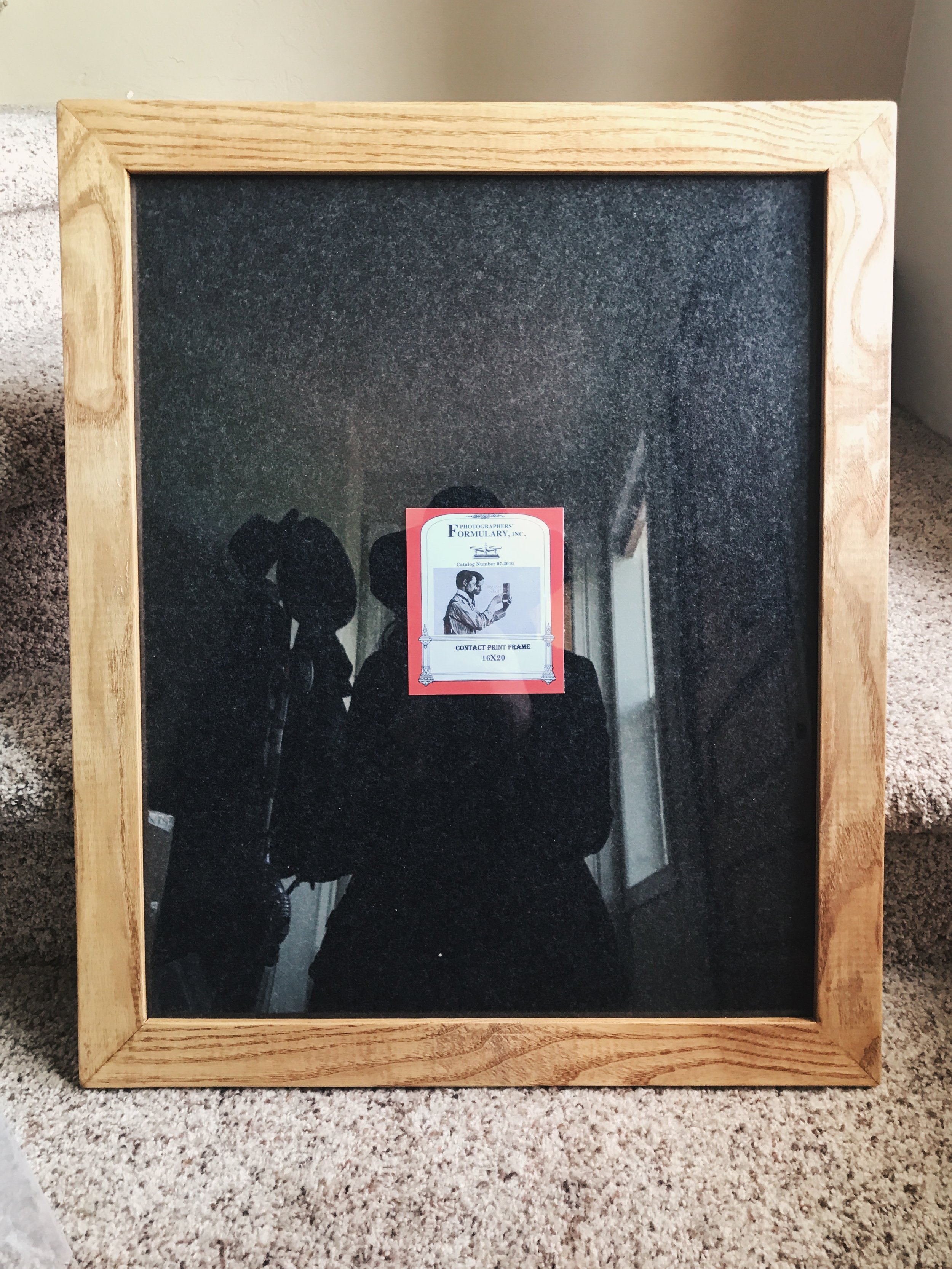

I bought my contact frame from the wonderful folks down at Photographer's Formulary. They have two different types of frames on their website: an economy frame and a swing arm frame. I bought a 16x20 economy frame for $92.25. Their 16x20 swing arm frame sells for $165. I've yet to use a print frame with clips instead of arms, but the price difference was enough for me to give it a go. The only other frame I've used is from Bostick & Sullivan— it's incredibly well-made and sturdy, but their 16x20 frame is $264.99 (I might have graduated, but that doesn't mean that the frugal art student in me disappeared).


The incredibly fun part about having your own workspace is that you can do whatever you want with it. I put my grandfather's chalkboard on the back corner counter (he used it to teach himself Spanish, I'll be using it for quick process and chemistry notes), and I found the cutest little retro toy refrigerator to use for small item storage— tape, pigment tubes, clothespins, etc. A light will be going in soon and my trays are supposed to arrive next week, so hopefully the first official print will come to be in the next few weeks.
on laminate and patience (and a project)
I'll start with this: I thought this project was coming to a close when I made my last post.
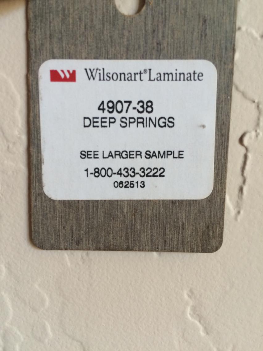
LAMINATE
I was asked to search for two 4'x8' sheets of laminate, which seemed easy enough. Practically every hardware store carries laminate tiles, so they should have laminate sheets, right?
I started out at Lowe's, which had hardly any laminate to begin with. After spending a couple minutes in their single bay of laminate, I left. Next was Home Depot, which had vinyl sheets, but they didn't have two rolls of darker colors. They did have a wide variety of laminate sheets online, but it's best to see it in person and shipping sounded like it would take almost two weeks. I called Western Building Center the next day (surprise, they don't have anything either), but they sent me to Cost Less Carpet, which is a local flooring store. They had 4'x8' sheets of laminate at their Spokane store, so the product still had to be shipped, but it only took a few days instead of a few weeks. We also picked up a gallon of contact cement to adhere the laminate to the ulay.
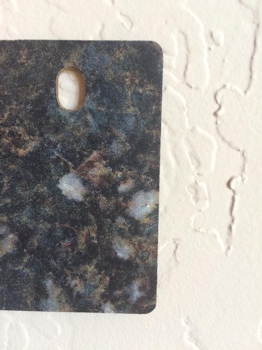
I chose a darker color in order to hide stains (lookin at you, silver nitrate).
PATIENCE
Everything seemed to be going well. We picked up the laminate and the adhesive today, which were both placed in the back of the truck. Fast forward a few hours. I happened to pass by the truck, and I noticed that something odd was oozing out of it. Lo and behold, the lid on the contact adhesive either popped off or the can burst, causing it to slop an entire gallon on the truck bed and drip down to the driveway below. I would like to say that there's a moral to all of this, but there isn't. Also, if you happen to spill a small amount of contact cement, mineral spirits on a rag will clean it up. We're still in the process of figuring out how you clean up a gallon's worth.

The adhesive managed to get on three tie-downs, a mattress pad, a chain, and the laminate box.

Note the smashed lip of the can, which could be why the lid popped off.

To put it simply, it works.
and A PROJECT
After calling the warehouse where we got the adhesive from and attempting to clean up the mess (which is currently rendered impossible), my mom and I switched to something less troublesome. This is where more of my DIY side comes in– this process has made me realize that my version of DIY might be closer to 'design it yourself.' My mom spotted this chair at a vintage sale for $15, and while neon 70s orange isn't my favorite color, it looked like it was practically brand new. The best part of this project is that it didn't cost anything in materials, but I did snap a screwdriver in half in the process of removing staples.
So, I don't have counters quite yet and there's a pool of cement adhesive in the bed of the truck, but I have a place to sit and imagine the completed darkroom and a clean truck.
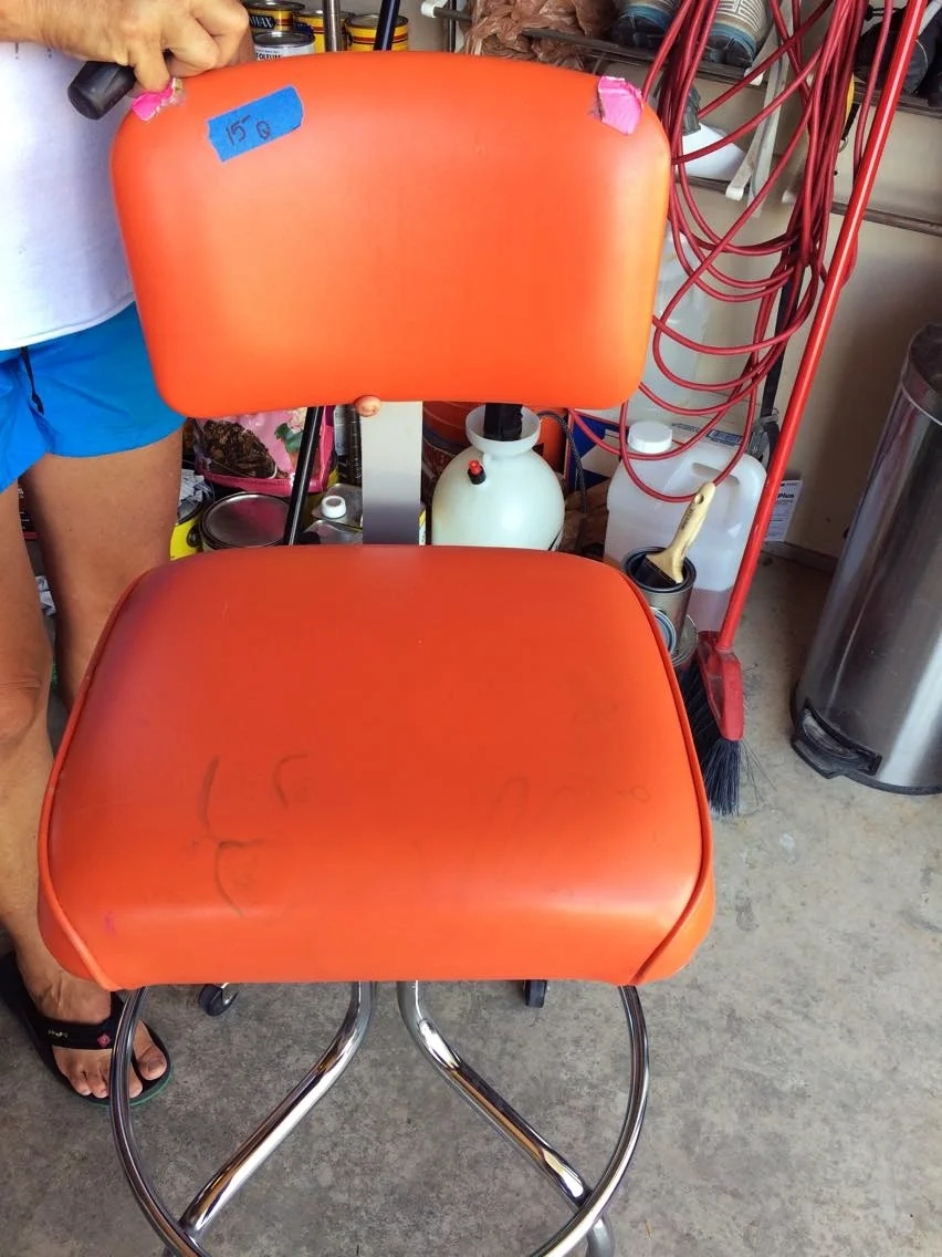
1973 orange, complete with pink duct tape and various faded stamps on the seat.

A significantly more subtle nod to the 70s.
counters
JULY 19, 2016
The end is in sight! Today is the day that my darkroom will actually start to look like a darkroom. However, that's easier said than done (here we go again).
Here are the original plans I had for the darkroom. It made sense in my head— three items (an enlarger, a sink, and a counter), three walls. We bought lumber according to this plan.
Plan 1, which for some reason included putting the sink on castors. I remember coming up with this idea and thinking that it was so clever. Hindsight is always 20/20.
(Note: the darkroom, while little, is not 8 inches by 12 inches).
LUMBER
- 4 4"x" 12' fir & larch (while pine is a cheaper option, fir & larch is known for being more sturdy and easier to stain)
- 3 ¼" underlay plywood (ulay for short)
- 3 ½" ulay
- 20 2"x4" 8'

The haul from the hardware store.

The original enlarger counter, which would make a nice portable bar.
We did a rough measurement, and despite my awareness of the standard counter being 36" tall, I decided that 40" would be a good height for the enlarger table (why, Megan? I often ask myself, but since I'm indecisive I always answer "I don't know").
Now, the enlarger I have is an Omega Condenser Head enlarger, which stands at 54" tall in total. With this in mind I still decided that a 40" tall table was okay. This put the top of the enlarger at 7'8", a whopping 2'4" taller than I am. In short, have a cup of coffee before you take measurements, or follow the age old "measure twice, cut once" (or just listen to the handyman who knows a lot more about construction than you do).
Our handyman built it that way per my request. He was pretty happy when I realized that he was right all along, and so we switched to a plan he came up with. My original three-counter, space wasting idea was traded for a counter surround that would give me an insane amount of counter space.

Plan 2, which includes a 'U' counter and a workable enlarger height.
(Note: some people are talented enough to make the same mistake twice.)
One of the great things about the new plan is that it uses significantly less lumber, which means putting some bills back in your pocket (think of me as your bumbling guinea pig for this project— I'm running on one of those hamster wheels thinking I'm actually going somewhere and you're aware of the tank around you on a metaphysical level). Anyway, the point is that this is cheaper and more work/storage efficient.

The enlarger is now at a workable height of 32".

Our handyman notched the 2x4s under the sink by about an inch and it fits perfectly. Also, I am officially in love with the amount of counter space. It's the little things in life.
ceilings & floors
JULY 16, 2016
My order for the day was to paint the floor, but, as you might have guessed, I got distracted. The shop was delivered with studs in the interior, minus the plywood floor. I, being a person who watches too much HGTV, decided to stain the studs on the ceiling. This seemed like a perfect plan– I would stain the beams and then paint the floor, so if a couple of drops of stain made their way down it wouldn't matter.
As I started to stain the first beam, I realized that this might have been a mistake. Here's a list of things to keep in mind:
- If you've insulated your darkroom, it will be warm, especially during the heat of the day
- A 4' ladder might not be tall enough to reach the peak of the ceiling, especially if you're 5'4"
- Beams have three sides
I stained as many of the beams as space would allow (about 5), which took roughly 4-5 hours. This would have been much faster if I was A) taller, or B) able to think of walking back to the garage to get a 6' ladder.
On the bright side, painting about 96 square feet of flooring seemed like nothing after standing on tiptoes on a ladder. For the floors I used an oil-based porch paint by Valspar. Try as I might, I am not always a tidy person, therefore the floors could not stay bare. The best and cheapest tool I've found for painting a floor is a Handi Painter. At less than $2, this is probably the cheapest part of the whole process.
Pre paint and stain
Half a beam in. I originally thought I could get away with not staining those triangular plywood pieces, but (surprise) I was wrong.
Mostly done
having an exterior darkroom
MID JUNE, 2016
Once I had caught up on sleep after my trip to Peru, I was eager to get to work. Of course, with life being the way it is, I did not jump out of bed after arriving well past midnight to sort out my darkroom.
About a week after I got home, I gave myself a designated darkroom day. The goal was to clean off start staining the outside. As I eagerly opened the doors to my little darkroom, I was greeted by a host of earwigs (an important thing to know at this point is that I am not, by any means, a bug person, especially concerning the slithering, tiny scorpion monsters that are earwigs). My initial reaction was to slam the door shut, which I did, but that doesn't make an earwig colony disappear. I spent the next 20 minutes or so standing at the threshold with a gallon of bug killer, and I, Megan Crawford, managed to squish earwigs with sandals on (as opposed to the more defensive close-toed shoes).
The moral of the story, as there is a point to this, is that an outbuilding is going to have bugs in it from time to time. Just mentally prepare yourself for that, be it a spider making its home on the ceiling or a herd of earwigs living in the doors.
After the earwig debacle, I pulled out the can of stain (Cabot semi transparent stain in Cordovan Brown), and my mom and I proceeded to stain two walls over 5 hours. Staining the exterior might not be entirely necessary, but that all depends on where you live. In Montana we get all four seasons, sometimes all within one day, so I wanted to be sure that the walls would last and weather well. You could also simply seal the walls with a spar urethane, but I seem to be good at making projects more complicated than they need to be.
interior finishes
EARLY JUNE, 2016
I was eagerly awaiting the arrival of my little darkroom (you can't do much when the building itself isn't there), and, how all things seems to go, the building arrived the day after I left to travel for 15 days.
While I was hopping between states and countries, my family's handyman, Joe Leone, insulated the walls and installed the tongue and groove planks. I briefly thought that I wouldn't need insulation (which is a funny thought in Montana, where snow is definitely a common thing in the winter). This would be the first of many initial ideas that were wrong.
We used a basic fiberglass insulation in between the studs, and all of the tongue and groove, which we got at a considerable discount, was from RBM Lumber.
So, as this project is panning out, it's becoming not as DIY as I initially envisioned. Traveling is certainly part of that, but I'm also not too familiar with the building side of DIY, although I like to think I am.
the learning curve / the supplies
LATE MAY, 2016
What I've discovered so far: garage sales are perfect for supplying a dimroom. Now, your average sale won't have the "big" supplies (chemistry, a sink, miscellaneous lab supplies), but they will have things that are still necessary. Think of shelves, lighting, containers, things that could double as trays– you get the idea. They have the answers to all of the missing odds and ends.
THE SUPPLIES
- 8'x12' shop from the Shed Man (this is by far the biggest expense, but arguably one of the most important ones)
- laminate counter– a few bucks from a garage sale
- cat litter containers for water/chemistry storage– free from a garage sale

A laminate counter I found at a garage sale. Once I add legs, this will work as the dry side counter.

The plot where the shop will be placed
day one
MAY 2016
As a self-proclaimed DIY lady, I've decided to embark upon outfitting my own dimroom. The catch: put it together on a budget, and put it together without running water or a drainage system. I'll be posting updates to this page as the project progresses, from the cost of supplies to DIY plans. Here we go.
THE PLAN
Put together a workable dimroom on the fly (probably easier said than done. We'll find out).
I was originally planning on putting a dimroom together in a spare closet, but the ceiling of the closet I would have used follows the roofline, which severely limited the amount of workable space.