gum experiments pt. 1: iridescent + duochrome pigments
It’s kind of a weird time to be an artist.
I feel guilty for making art because it feels frivolous— I have the privilege of owning a creative space and being able to use it now. I’m not making thought-provoking statement pieces; I’m creating for the sake of creating. It’s been the best thing for my mental wellbeing, but it’s important to mention both sides of the coin.
It’s a weird time to be an artist, but it’s also exactly what I need. It’s what a lot of people need— keep creating for the sake of creating. You don’t have to make masterpieces or earth-shattering social commentaries (but props to the artists that are doing all of that), you can just make art. That’s why I took up painting and cross stitch. Do some artists look down at people who follow Bob Ross tutorials? Absolutely. But why? Art isn’t an exclusive club. I’m not saying that my paintings are works of art— I’m not a painter, it’s just fun. It exercises a different set of creative muscles. So follow along to Bob Ross, make a paint by number, doodle on your grocery list, throw a wiggly piece of pottery. You don’t have to create an exhibition piece, and you don’t have to feel bad for not making one.
I’ve been setting up my dimroom again over the last few days— migrating chemistry, trays, and bins of paper down to the front yard shed (my diy dimroon, complete with one outlet and a PVC pipe & a cat litter jug for plumbing). I haven’t printed since July 2019 because life gets busy and messy (and running a magazine is way more than a part-time job).
Getting back into the dimroom again is kind of like riding a bike, except everything’s in a slightly different spot. All of the times and measurements are still filed away in my brain, but I have to dig deeper than I do when it’s peak workshop season. I forgot how much citric acid goes into the first cyanotype wash, I couldn’t recall the classic cyanotype exposure time for HPR off the top of my head, it took me a hot minute to remember the steps for a digital negative. I still can’t readily swap celsius to fahrenheit, but it all comes back one way or another.
I first started working with iridescent pigments in 2017— right out of the gate of graduation, after TAing my first workshop. I had the time and the mental capacity to work with different alt experiments, but even then I never finished a print. I got a few layers done before we headed into fall, and then the dimroom was back in my bathroom and I mainly stuck with cyanotypes.
In 2019 I bought two more iridescent/duochrome pigments with the intent of making a print on black paper. After shrinking a massive batch of black paper that was not made to be shrunk and consequentially buying the correct paper, I got three layers of white gum done. Then fall came and the dimroom went back upstairs.

electric blue (iridescent)

aztec gold (iridescent)

scarab red (duochrome)
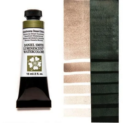
desert bronze (duochrome)
So now, in between magazine issues and in the middle of a pandemic, I’ve finally gone back to those pigments and prints. I do realize that there are better pigments to work with as far as color payoff goes (especially scarab red on black paper, which is essentially nothing in the way of color/pigmentation), but I wanted to try a variety of pigments and see how far it can go.
so, there are four prints:
the control (plain gum on white paper)
iridescent gum on black paper
iridescent gum on white paper
iridescent gum over cyanotype
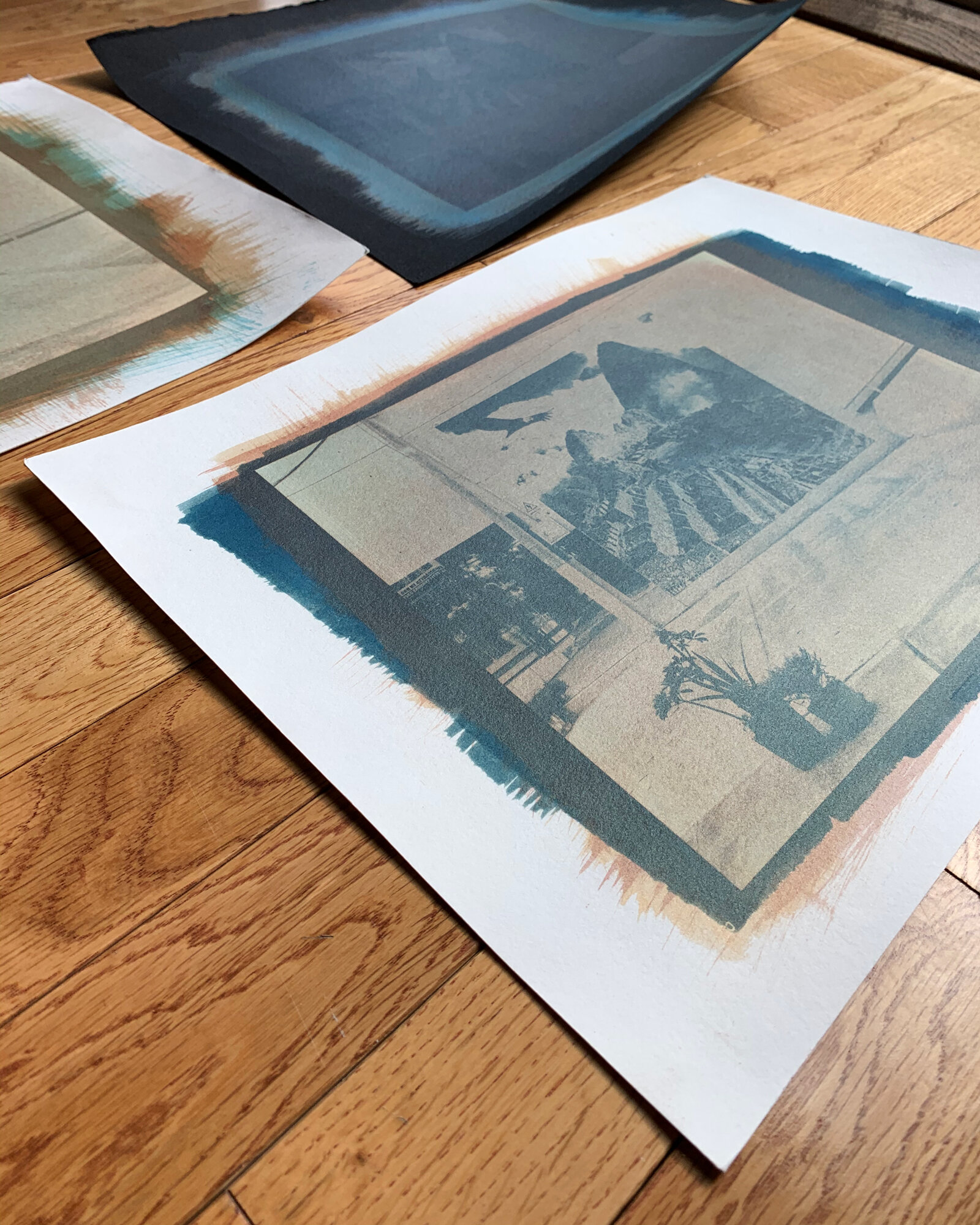
I’ll preface this by saying that I chose one of the worst images I could for this. I love the image and the original gum print, but it is not made for iridescent pigments or black paper. It’s grey concrete and asphalt on a grey day— the highlights are, at best, grey, and the dominant colors are just shades of blue.

the original/control print: standard gum pigments (phthalo blue, nickel azo yellow, q. rose) over a very faint bleached cyanotype.
white gum on black paper
As we know, not all papers are created equal. I found black Fabriano paper pads on sale at a craft store, so I bought three packs (I think they were all under $2 each, so how could I pass that up?). I tore out a few sheets, filled up my bathtub, and left them to soak for an hour or so. However, upon returning to my bathtub, the water was purple-grey (dye), the sheets had separated into individual layers, and everything was stuck together. I tried to take them out of the water, but several tore (because it’s not a water-friendly paper), and as they drip-dried in my shower they left purple puddles. A smarter person would have looked the paper up before buying it and noted that it “accepts light water,” which would not be an hour-long soak.
The paper I’ve used for the print below is Arches Cover Paper in black (250gsm, water-friendly). It does have a smoother side, which I of course didn’t use. Sometimes you’re just too excited to try a new print that you don’t bother to feel the paper, you know?
It was passible as a white gum on black paper (not the best print I’ve made, but definitely not the worst— I’ll add my first go at white gum from 2017 for comparison). One thing I forgot to consider was registration— I always register by eye, but you’ll want to use some form of pin registration for working with white gum.
I used a 12% titanium white for the Perú print, but since I did those layers last year, I can’t remember the time (however, I know it was longer than the standard 2-3 minute exposures I use).

three layers of white gum (12%) on Arches Cover Paper— the registration is off, but the opacity is there

the first attempt at white gum, one layer on Strathmore paper (also not water friendly)
adding iridescent gum
I’ll start by saying this: I made the original print worse. My original thought was to use positives for the entire print, but you only use a positive for the white layers. For the white layers, you’re trying to build up midtones and highlights, which is why you use a positive. However, your color layers go into the midtones and shadows, which is why you use negatives. It seems simple, but I didn’t catch it until after I did a cyan layer with a positive, essentially taking all of those highlights and muddying them up.
Believe it or not, this is technically a tricolor gum. Three layers of white, an accidental positive of electric blue, a correct negative of electric blue, aztec gold, and scarab red. I didn’t expect much from scarab red since it “disappears” on dark paper, but I didn’t anticipate the electric blue to take over (for reference, all iridescent pigments are around a 12% mix— I’ll get exact numbers the next time I’m out in the darkroom).
Since the pigments are iridescent, the final image changes based on the light source. It’s one of those where you can hold it and move it around and see something different, which has some merit as far as “championing the object” goes. However, there is absolutely room for improvement. This is just a starting point, though— you learn from the mistakes you make.

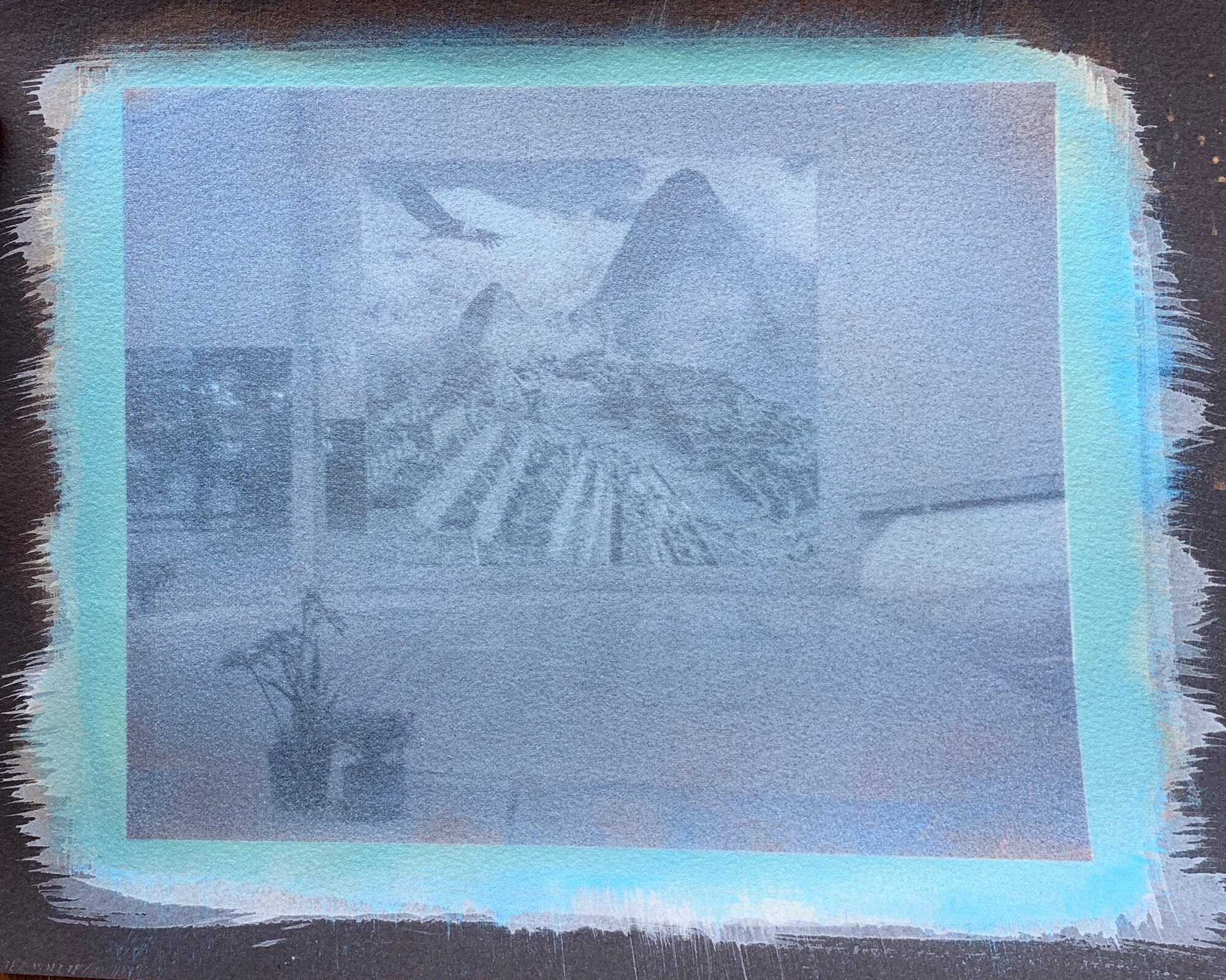
indirect sunlight

window light
plain iridescent gum
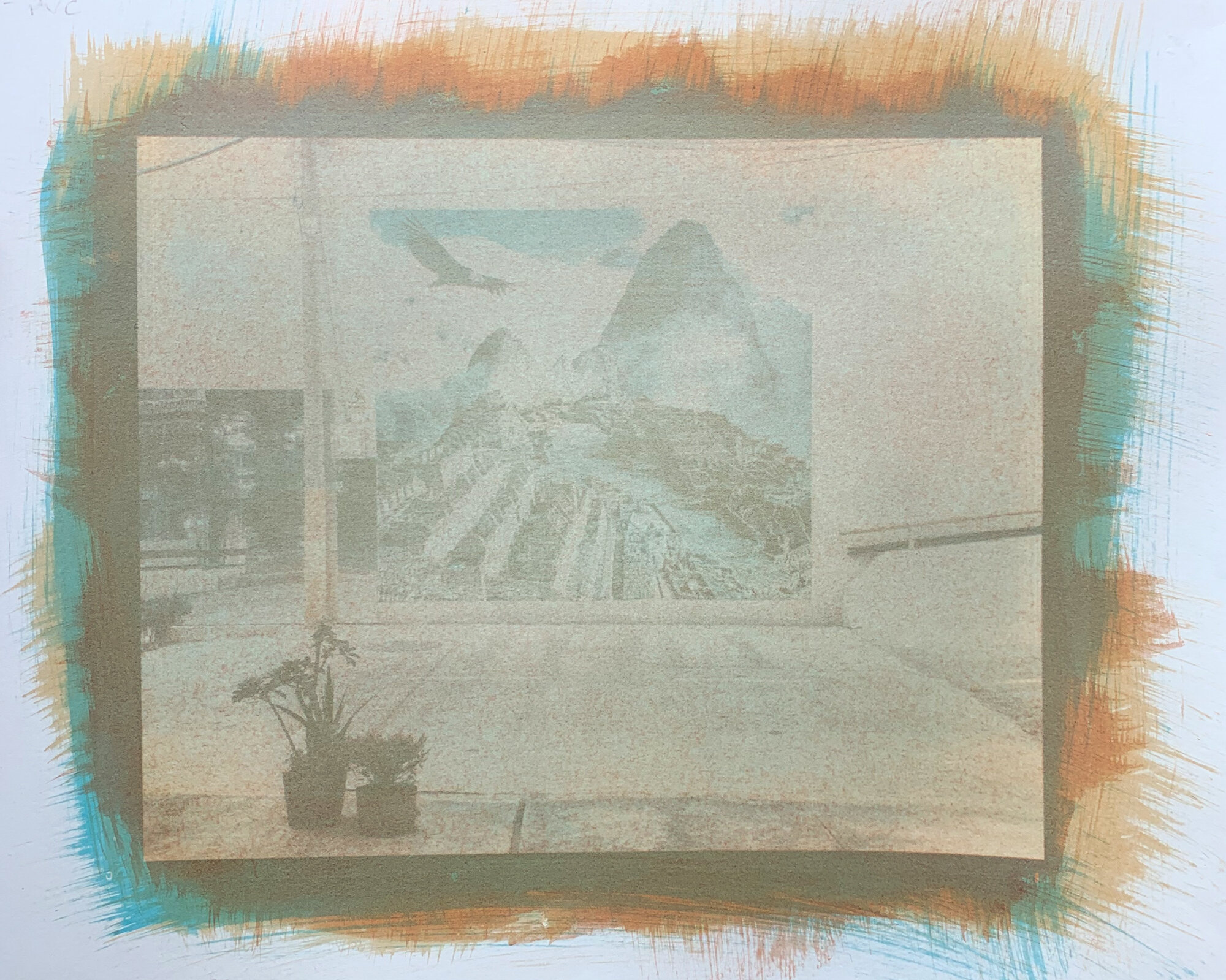
The second variable is a standard tricolor gum on white paper, but with iridescent pigments. I wanted to see how the colors would interact with white paper, since scarab red and aztec gold don’t do a lot on black paper. I again used my standard exposure times (2 minutes for magenta, 3 minutes for yellow, and 2 minutes & 30 seconds for cyan). The result reminds me of natural earth pigments, which I used in the past with a decent amount of effort. If anything, it can be a good way to fake eath pigments without having to grind gum & powder in a mortar. There is still some iridescence, but you completely miss out on depth.
Steps for this print are as follows: standard shrink bath (warm water, about an hour); PVA size; electric blue, expose for 2 minutes & 30 seconds, wash for an hour; aztec gold, expose for 3 minutes, wash for an hour; scarab red, expose for 2 minutes, wash for an hour. I’ll try this process again with a more punchy image, and hopefully the beloved magenta layer won’t stain the paper.

indirect sunlight

window light
iridescent gum over cyanotype
This is the golden ticket: it gives you the best of both. You can register the negatives, but you’re not fighting for shadows. There’s still work to be done and things to iron out, but this was by far the most successful print.
I did a standard classic cyanotype (10/10 ferric ammonium citrate and potassium ferricyanide), but I of course left it in the light box too long. The highlights were completely gone, so I decided to bleach it in sodium carb. The print’s still too dark and the highlights aren’t so great, but it brought it back enough to be able to add some gum layers.
Following the cyanotype, I did a layer of aztec gold and then a layer of scarab red (so just 3 layers total). I could have gone back in with more layers to work back and forth, but since the other two prints are essentially just three layers of color, I wanted to keep this one the same. This print also shows iridescence the best without losing the image quality (probably in part to swapping the dominant electric blue for a cyanotype). It gives off a sort of copper/gold split tone effect with the blues of the cyanotype, which is worth exploring!

the cyanotype layer after going through a sodium carb bleach bath

the tricolor print— cyanotype, aztec gold, & scarab red
in conclusion:
Make what you want to make, break the rules (within reason— keep the chem safety). If it doesn’t work, it doesn’t work. If anything, you’ll learn from your mistakes.


this is part 1 of a multi-part series on experimental gum printing; posts will be added as prints are made.