
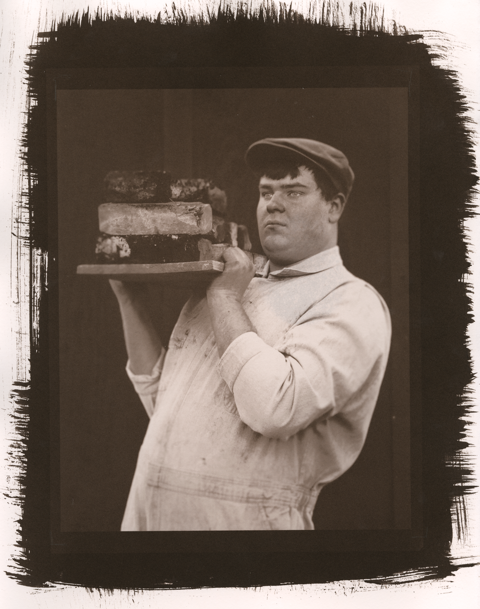
Of all the alt processes I’ve learned and worked with, salt is the one I feel I’ve spent the most time with. From testing papers and salts to exposures and methods, most of my research lies in salted paper printing. Think of this page as a research time capsule: this will have almost everything I’ve done with salt (if it’s not up here it’s because I forgot, which happens). If you want to know my current salt practice, scroll to the bottom of the page. If you want to see every trial & error, every mistake, and every ah-ha moment, start here.
2016
Through the graces of chance and being in the right place at the right time, I found myself in Montana State's photo department, working in alt, with none other than Christina Z. Anderson. The semester that I took her Alternative Processes class was also the semester that she relentlessly began to experiment with salted paper again (her salt findings can be found on her website, here).
I had an idea for a project on 19th century Scottish family history, and I wanted it to be authentic. The Talbotype, a slightly earlier form of Salt, was 19th century Scotland's premiere printing process. Thus, I dove headfirst into the world of salt.
Early on, it was brought to my attention that Salt is notoriously picky, but it was beautiful and through sheer stubbornness I was going to make it work.
Photographer's Formulary Salt Kit (an excellent option if it's your first time salt printing)
Anderson's Alt Process book, Gum Printing and Other Amazing Contact Printing Processes
sodium or ammonium chloride (I used ammonium)
sodium citrate (optional)
patience, or at least a way to relieve stress (technically optional but very highly recommended)
hake brush (I use a 3 1/4" brush)
suitable paper (I used Arches Platine)
distilled water
salt (regular old table salt, no iodine)
gelatin
silver nitrate (I used a 13% dilution)
Salt is a picky process. It's paper picky, brush picky, negative picky, chemistry picky– the list goes on. A number of issues can crop up in a print and many of them don't become apparent until the print has been processed and dried.

Dark mottling due to improper sizing.

The blotches on either side of the image are due to uneven drying.

A lavender splotch– it's about the size of an egg. This was taken immediately after taking the print out of the last wash.
Same print, same splotch, but it's significantly faded. This was scanned about a day after printing.

The white flecks are due to using a paper that does not work well with salt (Fabriano), and the streaks and lighter areas are result of both improper drying and coating issues. While the streaking can't be fixed, the spots can be filled with Prismacolor pencils (Sepia for darker areas, Warm Grey for lighter areas).

Don't coat salt while stressed (whoops). Also, it has been brought to my attention by Chris Anderson that the white spots in the print are due to too much brushing.
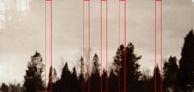
"Pizza wheels" (in the red boxes) are a printer issue. The feet of the printer leave dot trails, which cannot be fixed after printing.
Always check your printer settings before you print. Likewise, if you think you printed a negative incorrectly, don't make a print from it.

Same image, new negative.
2017
Morton salt
Morton sea salt
Morton kosher salt— the anti-caking yellow prussiate has yet to negatively affect a print
Pink Himalayan bath salt— the salt I bought didn't contain any additives, and none of the additional minerals present in Himalayan salt affected my prints
Hain sea salt— unlike Morton sea salt, Hain has calcium silicate in it, but I haven't noticed anything odd in any prints
Diamond Crystal kosher salt
Arches Platine— this is what I used for From Where They Came
Hahnemüle Platinum Rag— this is what I used for Riptide Nostalgia and American Mythos
Asuka inkjet paper in white*— I tested the 75 gsm and it held up through the baths, but it does dent easily (NOTE as of 2018: while Asuka is a beautiful paper, it is unfortunately not compatible with salt)
Masa
Strathmore Watercolor 200 Series
Vellum
Natural canvas
Cotton/Poly blends (the one I've tried is 65% cotton, 35% poly)
Satin
Pillowcases
Natural muslin
Velour— the problem with velour is that it's incredibly absorbent.
toning in tannins/acids
coffee
green tea
red wine
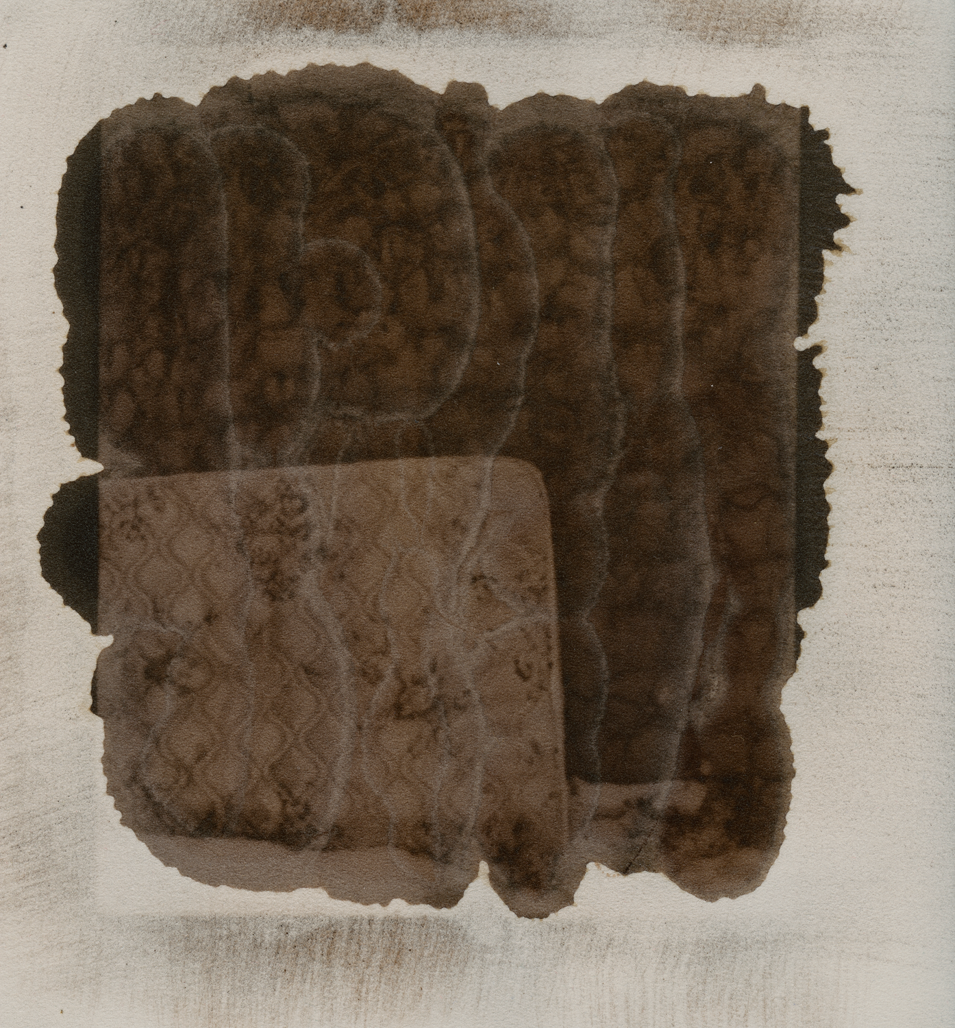
Sulfur and gypsum— when sulfur comes into contact with silver nitrate it creates silver sulfide. Sulfur's acidity could act as a toner, but it's water insoluble. I tried three different means of processing with sulfur and gypsum: coating at the sizing stage, coating at the sensitizing stage, and toning. The only process that procured a successful print was coating at the sensitizing stage. I mixed the sulfur/gypsum mix with water in a mortar and added that mix to silver nitrate 1:1. The resulting print is a lighter, purple-toned salt print with a grainy texture due to the silt texture of gypsum.
2020 (?) update: the sulfur print is now a brown blob, which could be used to a conceptual advantage, but it isn’t archival by any means.

75 gsm Asuka, arrowroot size, 15% silver nitrate, 18 minute UVBL exposure
Strathmore Watercolor 200 Series, arrowroot size, 15% silver nitrate, 18 minute UVBL exposure

Masa, arrowroot size, 15% silver nitrate, 18 minute UVBL exposure
I think Asuka has been my favorite "experimental" paper. It's slightly off-white, which complements salt quite well. The 75 gsm is a bit nerve-wracking to work with (the paper fibers have a tendency to pill up), but it has a delicacy to it that heavier papers often lack. Masa took chemistry well and it withstood the baths, but I prefer Asuka's warmth.
I also tested another two Japanese papers, both of which would require longer exposure times. Paper 1 is quick to absorb and easy to crease; paper 2 is translucent and more pearlescent than matte.
Velour has potential, but it absorbs liquid as soon as it hits the surface (hence the "pools" of silver in the print). PVA or another substrate might resolve the issue to an extent.

Paper 1, arrowroot size, 15% silver nitrate, 18 minute UVBL exposure

Paper 2, arrowroot size, 15% silver nitrate, 18 minute UVBL exposure
Velour, arrowroot size, 15% silver nitrate, 18 minute UVBL exposure

Vellum, arrowroot size, 15% silver nitrate, 18 minute UVBL exposure

Coating the paper with a 1:1 silver nitrate, water/sulfur/gypsum mix.
The 1:1 print our of the light box after an 18 minute exposure.

After the first 5% salt bath.
The dried print.
Sulfur, like velour, has potential. Scientific grade sulfur would probably have a more noticeable effect than a plant fertilizer mix.
While toning isn't something I would necessarily do often, I do life the effect of coffee toned Masa— it combines the delicacy and durability of Masa with the warmth of Asuka.

Coffee and green tea toned masa

Red wine toned Strathmore watercolor
Believe it or not, mistakes don't necessarily go away with practice. We're all susceptible to a blunder every now and then, whether it's from working in a new space, experimenting with new materials, or just rushing it and tripping over your own feet. Mistakes happen, and that's okay. Celebrate whatever mistakes you make— they're signs of learning, after all.

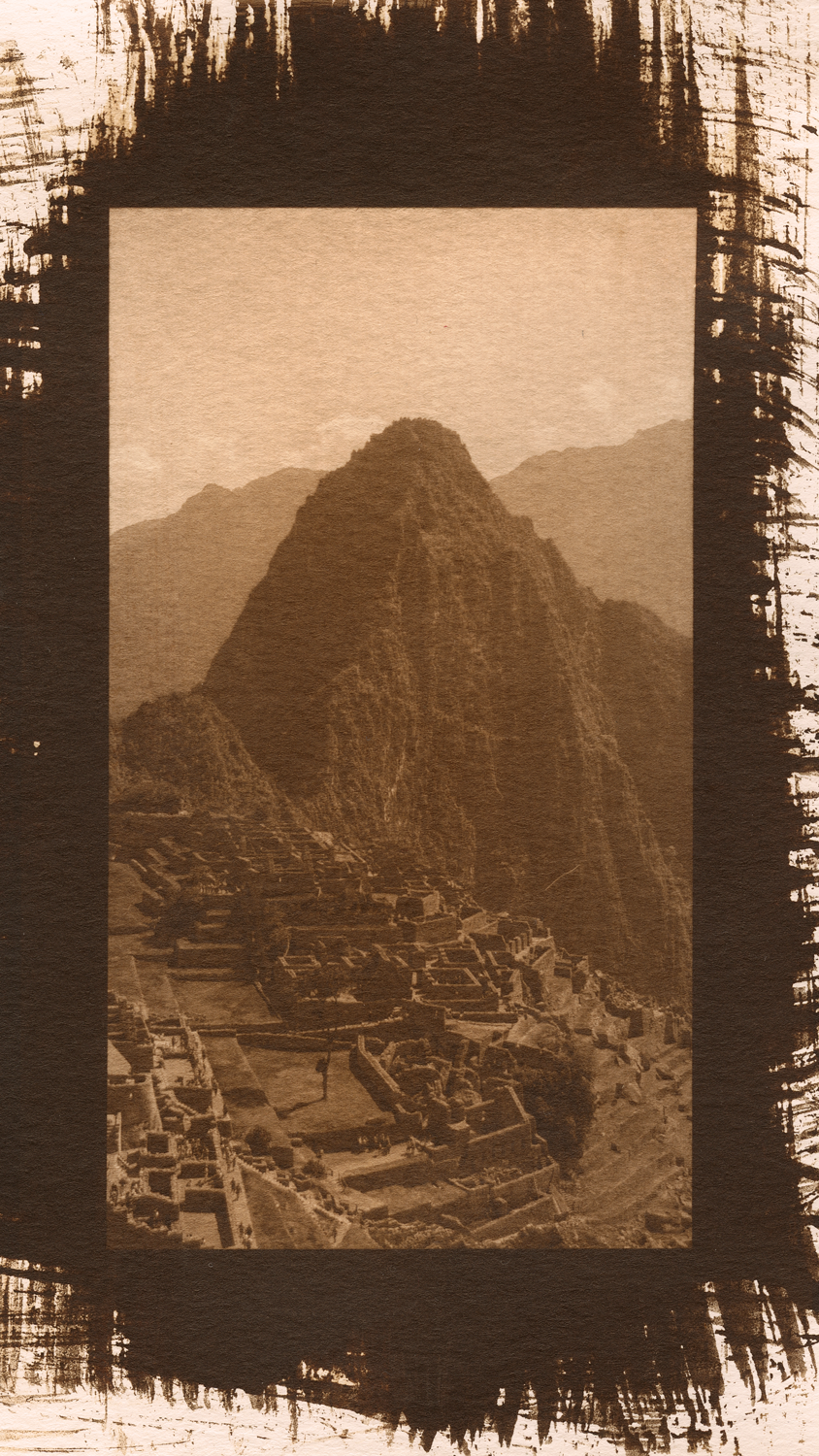
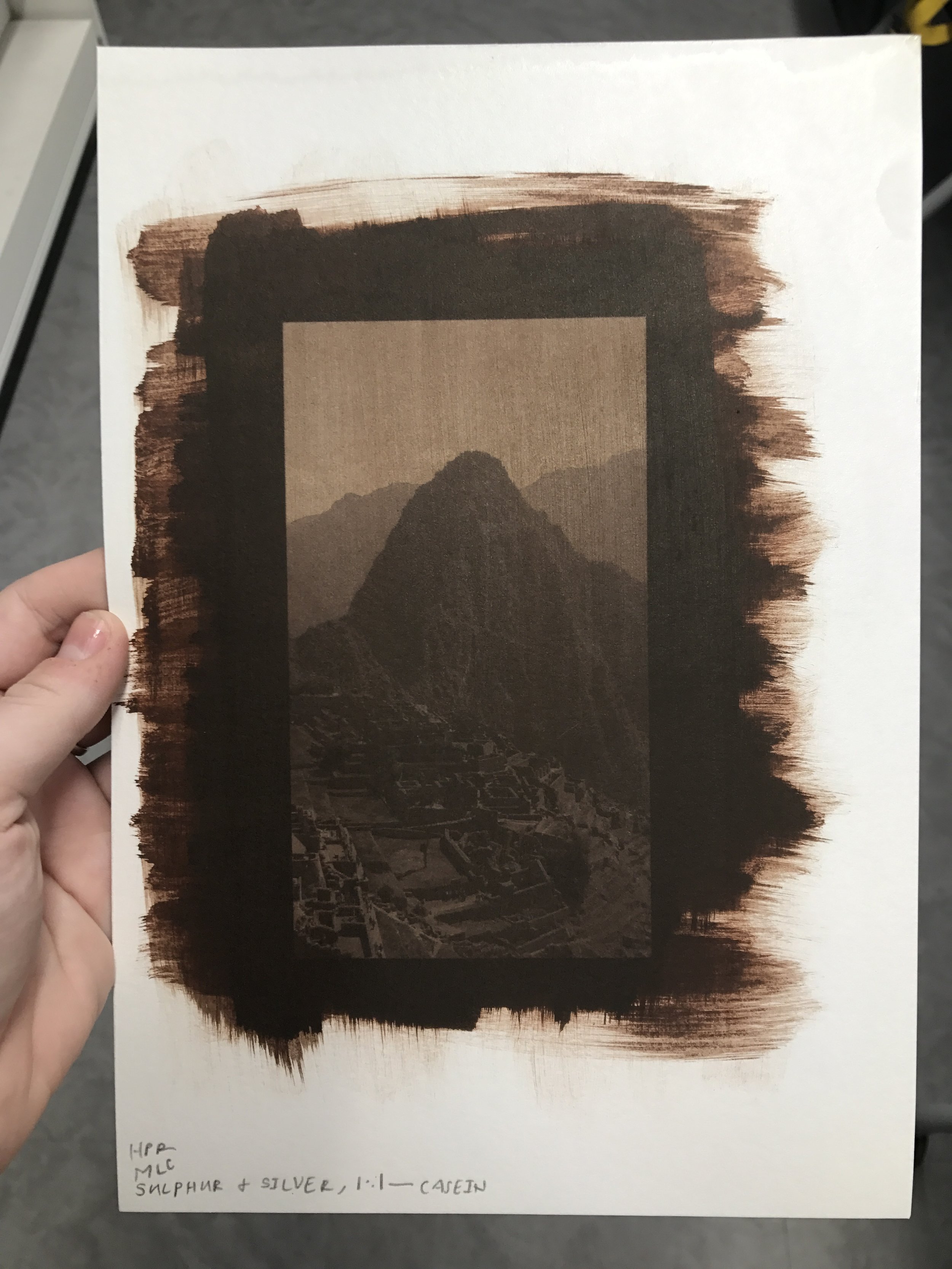
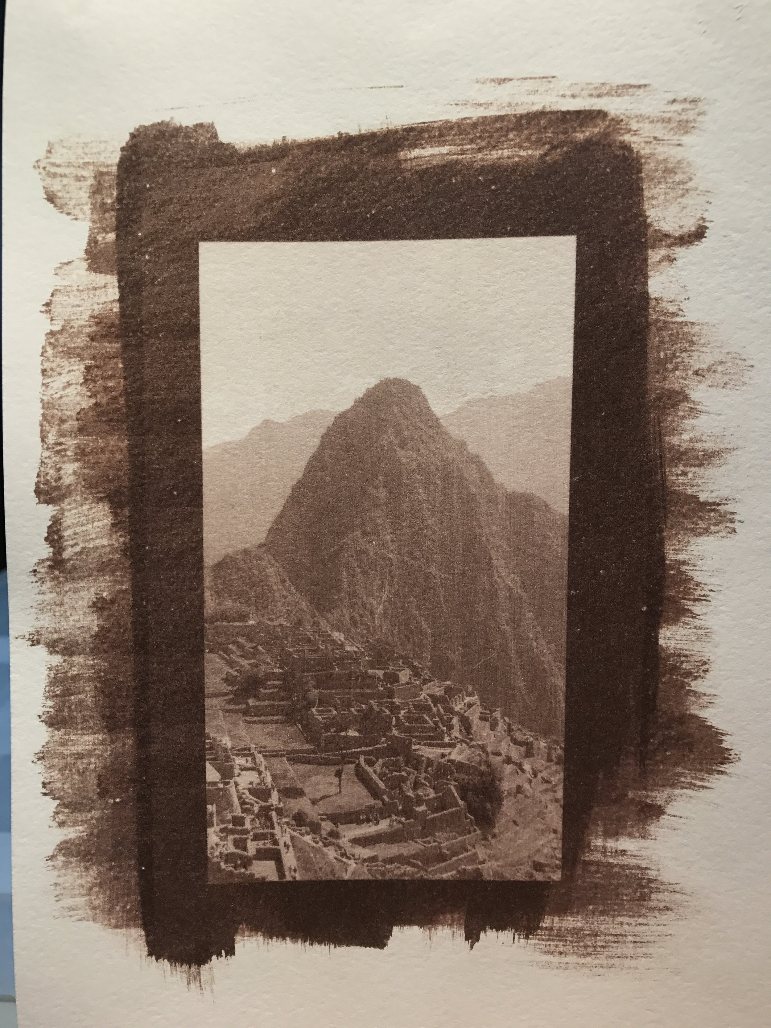
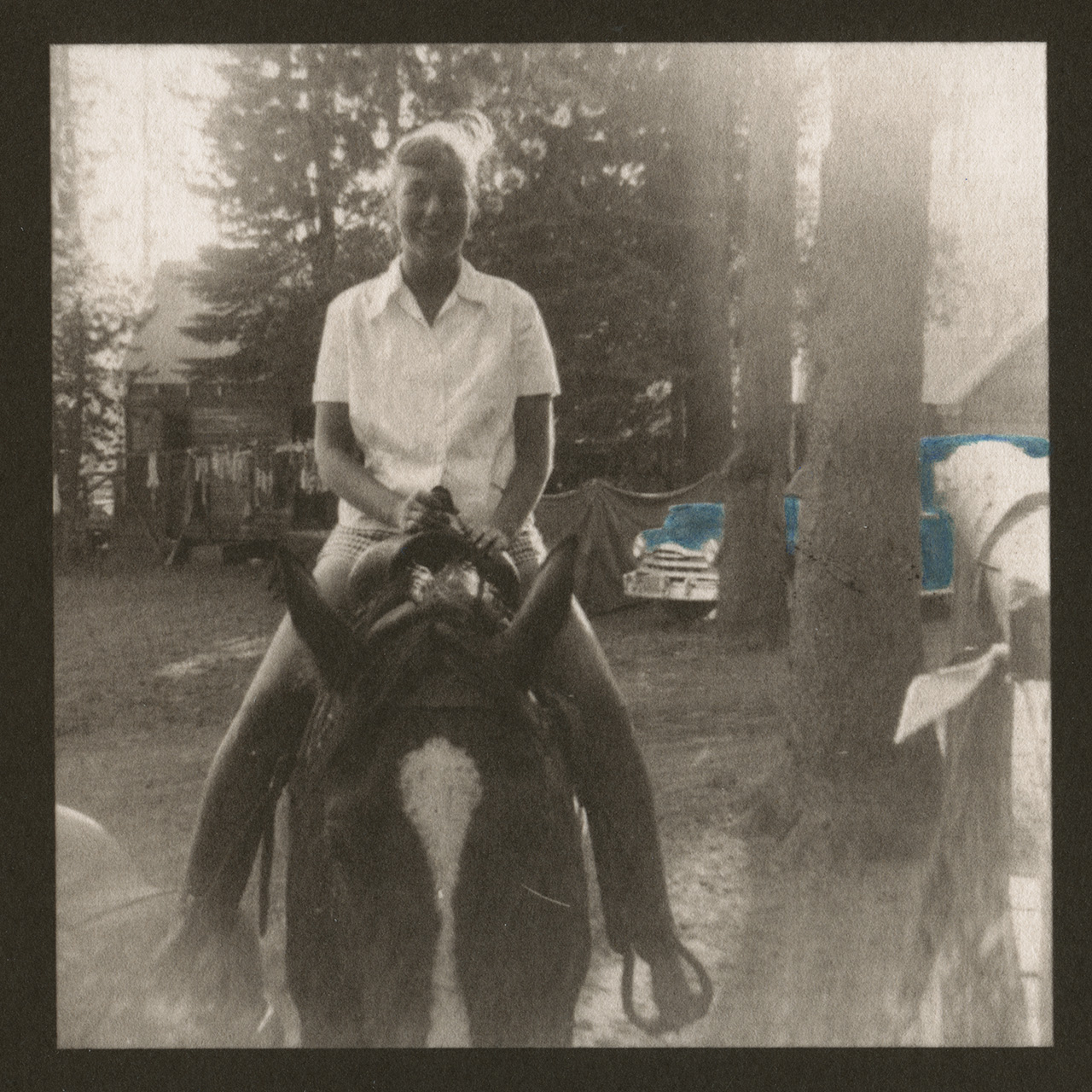
Leaving a print in fix for too long causes yellow staining. Salinas de Maras, Peru, 2016. 2017.
First things first, know your chemistry. This probably seems obvious, but humans can be forgetful creatures. Different fixers work differently (this is something I managed to forget). During my time at MSU, I used a standard paper fix for salt prints. That fix required two 4 minute baths. When I assisted at Photographer's Formulary, we used their TF-4 fix, which only requires two 2 minute baths (you can probably guess where this is going). I was working on this print to the left, and out of habit I left it in the TF-4 baths for 4 minutes each. This resulted in yellow staining (it's especially apparent in the cloud at the top of the print and in the salt ponds at the bottom of the print).
So, did I learn something? You bet. Will it happen again? Hopefully not, but now I know another answer to another question.
The lighter milk chocolate of fogged salt vs the dark chocolate of properly exposed salt.
I've been working in my diy dimroom for over a week now, and so I've learned a lot about the space. It wasn't until I made a salt print that I realized the shed was absolutely not light tight. I had this sensitized piece of paper in a closed, "dark" drawer in the closed "dark" dimroom. 20 minutes later, the edge closer to the door was fogged. It's not necessarily my direct mistake, but the dimroom is shored up now. Once again, it's another answer to a question.

Ever wondered what a print would look like if you put silver nitrate on the side of the paper that wasn't sized? This print is on Weston, which is a thinner paper. I brush-coated with casein and proceeded to not mark which side I coated. I used this sheet a year after I coated it, so there was no chance of me remembering (this is why you always write notes on your paper). Since Weston is thin, some casein soaked through to the backside (those darker splotches on the print). Always be sure to mark your paper.

Salt on fabric has a lot of potential, but you do have to choose your fabrics wisely. While canvas is one of the easiest fabrics to work with, its texture can often obstruct an image, especially if you’re working with a smaller negative.
Hand-colored photographs have a long history. Artists typically used oils, pastels, and watercolors to apply color to a print. You can use any of those mediums, but it's a skill set that I don't have. Thankfully in this 21st century world of ours, we have watercolor pencils. I primarily used a Faber-Castell set (this one specifically). There's a huge difference in quality from cheaper sets to more expensive sets. I started out with a $14 set of Fantasia pencils and they were fine, but the Faber-Castell set was a dream. You never really realize how many different shades you want to use until you have 60 pencils. To blend out the color, I used a #000 spotting brush. When I was starting out, I just used the flashlight on my phone to help me see where I was coloring. I tried a clip-on jeweler's magnifying loupe, but it was so heavy that my glasses just slipped off of my nose and onto my print. I then upgraded to a Vivitar LED magnifying glass, and that completely changed the hand-coloring game. I think it might be best to use a hands-free lighted magnifying glass, but the Vivitar one I used worked perfectly.
Since the images I used were originally black and white, I had nothing to go off of except for tonality. I usually tested out colors in Photoshop prior to coloring a print. Some prints ended up with way too much color, not enough color, or just the wrong color. Salt has a distinctively warm palette, and not every color will "fit" with it.

The glorious Faber-Castell set, the life-saving Vivitar magnifying glass, the #000 spotting brush, and a shot glass of water for cleaning the brush in between colors.

Here's a prime example of a color and subject choice that doesn't work versus one that does. The teal car became competitive with the image as a whole, while the multi-colored laundry stood out just enough (it's noticeable, but it's doesn't yell at you like that car does).

Most of the prints I colored were 4"x4", so items like the flag were smaller than the head of a pin. A magnifying glass was essential for accuracy.
2018
Salt will always give you an opportunity to learn.
Over a year ago, I made a hand-bound drum leaf book of original salt prints. I used Asuka since it was my standard bookmaking paper. The excitement of creating a book of salt prints took over, and it never crossed my mind to test Asuka with salt (granted, this was for a project, and I had an approaching deadline). I didn't notice any issues with Asuka, so I assumed I was in the clear. If salt has an issue with your practice, it'll let you know. There wasn't anything that made me reevaluate printing on an inkjet coated paper, but here we are.
Now, a year after crafting a one of a kind book, it has come to my attention that salt does not work with Asuka. The combination of the weight of the paper and the inkjet coating did some damage over time. So, a materials update: I still recommend Asuka, but only for pigment prints. If you're going to try out a new paper, test it before you dive in head first. Do a step wedge and a print, and let it sit for a while.
2019
Alternative processes are constantly changing and evolving— I’ve modified my printing practices every year. However, I’ve failed to update my process here as it’s changed, so I’ll give you the whole kit & caboodle now:
hake brush: I still use the same 3 1/4" Connoisseur brush, but I’ll hopefully upgrade to a Kobayashi brush soon. A coating rod is a good option if you’re looking to conserve silver nitrate.
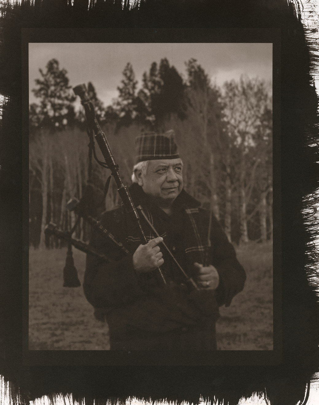
suitable paper: I now almost solely use Hahnemühle Platinum Rag. I still experiment with paper for salt, but my go-to will always be HPR.
distilled water: this will always stay the same. I only use distilled water for diluting silver nitrate, but depending on your water you may have to use distilled water in your processing.
salt: Diamond Crystal kosher salt, in a red 3lb box.
casein: sizing is a lot of personal preference, but I absolutely love casein. It’s the easiest size to make and work with in my opinion.
silver nitrate: I now use a 15% dilution instead of a 13%.
ammonium chloride
sodium citrate
hypoclear
Put 400 ml distilled water and ammonium caseinate in a food processor or blender and blend. The mixture will foam like whipped egg whites. When done, set the mixture aside until the foam subsides (about 1 hour).
Add the ammonium chloride and sodium citrate to the remaining 600 ml of water, stir until dissolved.
When the foam has subsided, mix the two solutions together.
Pour the solution into a tray and immerse paper one sheet at a time.
Interleave the sheets until they are soaked through. You can also brush size with the solution by pouring it along the edge of a sheet of paper. Brush the paper surface evenly so that the entire surface is glossy.
Hang dry, lay flat to dry (only if you brush-coated one side), or blow dry the paper and use immediately.
Casein is the only size I continually use. It’s less slimy than arrowroot and tonally warmer than gelatin (it’s also easier on your conscience compared to gelatin). This solution is best kept refrigerated. Do note that since it’s milk protien, casein has a bit of a smell and it will mold over time (use it up before it molds, it’s not a fun time. I’ve let casein mold twice now and it’s not pleasant by any means).
40 g ammonium caseinate (1/2 cup)
20 g ammonium chloride (4 teaspoons)
20 g sodium citrate (3 1/4 teaspoons)
1000 ml distilled water
Make sure that the sized paper is completely dry before sensitizing the paper.
It’s good practice to always sensitize the paper on a piece of Plexi. Silver nitrate will stain.
Mark the side of the paper that will be sensitized (initials, paper, size, exposure etc).
In subdued room light, measure out a scant teaspoon (5 ml) of silver nitrate for an 8”x10” print on 11”x14” paper.
Pour the silver nitrate along one edge of the paper.
Immediately and carefully brush the solution over the paper. Work horizontally, vertically, and diagonally with methodical brushstrokes. Keep brushing until the solution begins to absorb.
To make sure the surface is evenly coated, look at the paper obliquely. The entire needed surface should be glossy.
Make sure that the coating is evenly applied (no pools of solution anywhere). If there are pools, brush them out toward the edge of the paper.
When you’re done coating, hang the sensitized paper to dry in a dark space or set it in a dark drawer. After 20-30 minutes, depending on humidity, you can blow dry the paper. Be sure to work evenly. If the paper is not completely dry, it will stain the negative and the print frame.
Since salted paper has such a long exposure range, you can expose a print in a UV light box or out in sunlight. Exposure times depend on paper, size, silver nitrate dilution, and coating.
In a UV light box, exposure times will most likely range between 20-50 minutes.
In summer sunlight (10am-2pm), exposure times will range from 10-30 minutes. As outdoor UV light weakens, exposure time increases. Temperature is not a factor for outdoor exposures.
Tap water is fine for processing trays, but if you’re on city water you may notice staining or fogging. If these issues pop up, switch to distilled water.
You’ll need seven trays for processing a salt print:
5% salt wash— 4 minutes
5% salt wash— 4 minutes
Plain water— 4 minutes
Fix— 2 minutes (if using TF-4)
Fix— 2 minutes (if using TF-4)
Water— 5 minutes
Hypoclear— 4 minutes
Water wash— 30-60 minutes
Hang dry

left: a “control” salt print; digital negative printed on Pictorico Ultra Premium OHP, casein size, 15% silver nitrate. center: digital negative printed on Fixxons, casein size, 15% silver nitrate. right: digital negative printed on Fixxons, old gelatin size, 15% silver nitrate.
This trio was made at a workshop, which is where the best mistakes happen. I’d accidentally printed a salt negative on Fixxons— I typically use Pictorico Ultra Premium OHP for salt because it can withstand a denser ink load. Of course, I still wanted to make a print with the Fixxons negative because how amazing would it be if you could just use the same OHP for every process?
I printed using the Fixxons first, and to an untrained eye or without comparison, it’s not a bad print. But as soon as you see it against a proper salt negative, it looks grey-green and washed out (do note that I used the same paper, size, brush, exposure unit, time, and process— the only differentiation was the negative).
As far as the third print goes, I brought old, moldy gelatin size with me to a workshop (this is a great way to assert your authority as an instructor). But there’s always a chance to learn! I wanted to show my students the importance of using a proper size, so I went ahead and made a print with the lumpy, moldy gelatin size and the washy Fixxons negative. The print itself is lumpy because the gelatin gloms held on, so all of those dark spots you see are raised. It could totally have some conceptual merit if you work it just right, but moldy size is pretty nasty so do with that what you will.
2021
I’m beginning to realize that I may need to rework how this page is set up, as it will eventually become impossibly long to scroll through. (also, do you totally switch it up and put updates at the top? or is the traditional timeline better? life’s eternal questions)
I will always smush my art practices together. If I could print something on ceramic, embroider it with wire, fire it, smash it, and repair it with gold, I would find a way. After dipping my toes into alcohol inks, I (obviously) immediately tried using them with alt. I already have a soft spot for gold gesso, so the unpredictability of gold alcohol ink on cotton paper is the latest White Whale.
Does it work? I mean, I made this:
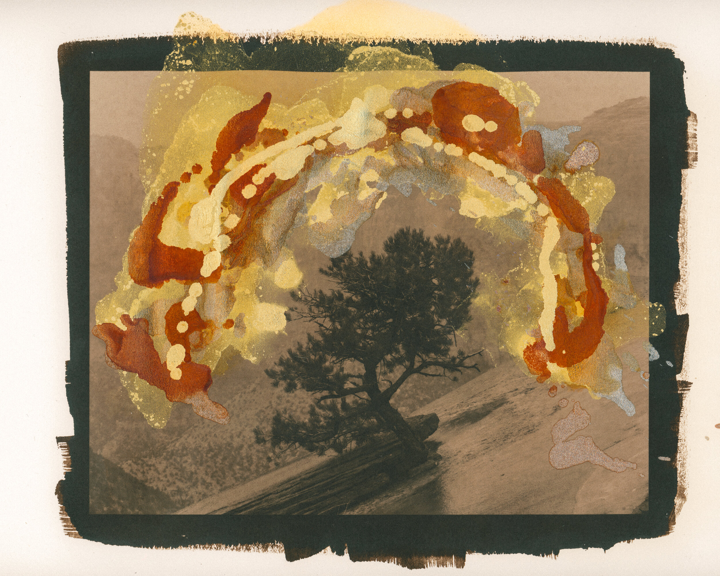
15% silver nitrate, casein sized, hahnemühle platinum rag. 5 layers of diluted PVA were coated onto the print before adding the alcohol ink (if I had undiluted PVA on hand, I would use that instead). Gold, copper, and silver alcohol ink, added in several rounds.
Behold, the actual worst thing I have ever made. In my defense, I wanted to see how far I could push the paper with layers of rubbing alcohol and ink. But oh my god, it makes me snort. I want more artists to share their shit prints, because I know I’m not the only one out here making some absolute Dumpster Fire™ work.
I have made some truly bad prints, but this one is egregiously, garishly bad. It’s audacious in its terribleness. So, obviously, I’m going to make more.
Of course, I’m not going to leave you with one failed print. There is a successful print (granted, it’s a cyanotype so it might disrupt the salt flow, but I feel the need to redeem myself).

Classic cyanotype (10/10), hahnemühle platinum rag, 7 layers of diluted PVA, 2 rounds of gold alcohol ink.
Note that this is still a work in progress and I have more theories to try!